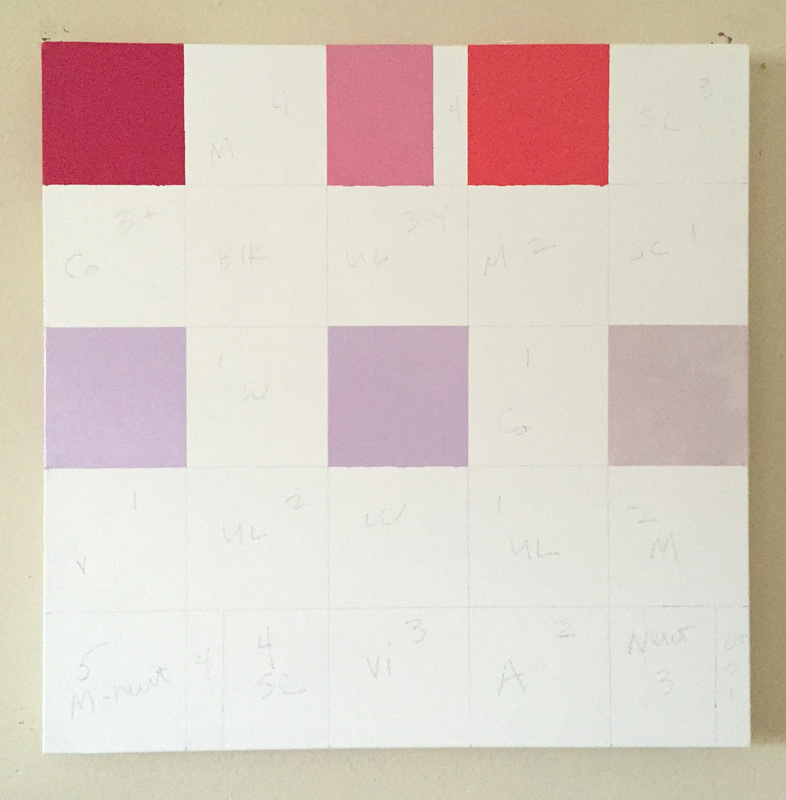
 I am beginning a pair of 20" x 20" canvases that I have in mind for a show in March/April. The colors are beguiling, even for me. I tried to talk myself out of going ahead with this project, because it may be that there won't buyer, that the colors are not as popular or relative to current decor practices. But I have to paint them! I must paint them simply because it is in me to do so, and these colors were conjured up from the deepest level of my inner artist child, a place that cannot be ignored for long. Otherwise I am only painting safely, and that's smart, but not always good. 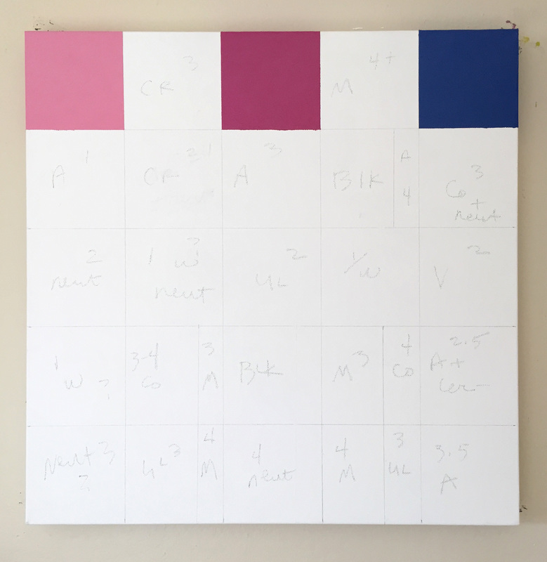 Tags: Modernist oil painting, Abstract oil painting, Oil painting with reds, violets and blues, Minimalist art, Colored geometric paintings, Modern painting, Color blocking, Interior design, Color design, Colorist
0 Comments
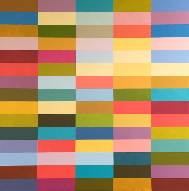
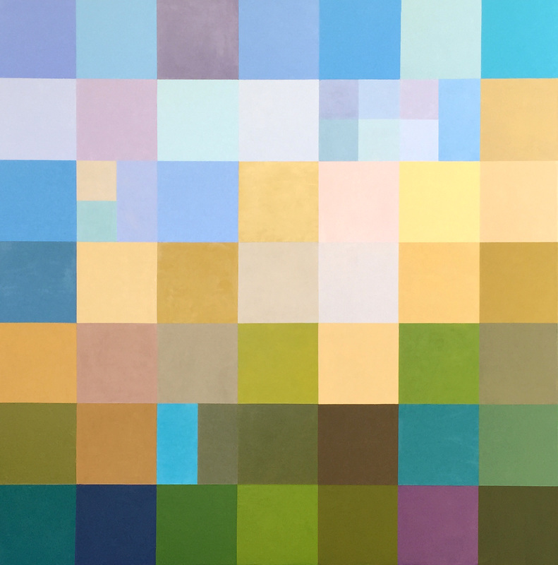 Rancho Bodega, 36" x 36", oil on canvas The above image shows the completed painting of Rancho Bodega. Looking at the image below, it shows how I struggled with so many yellows, and I struggled with the area with the small squares on the upper right. The design originally planned for more yellows up in that area, however, the design was off-putting. Presently it still creates an area of interest without feeling congested, and I like the variations of the blues and violets. In addition I altered the center part of the painting with a couple neutrals where there were so many yellows and golds. The variation creates a far more interesting painting. 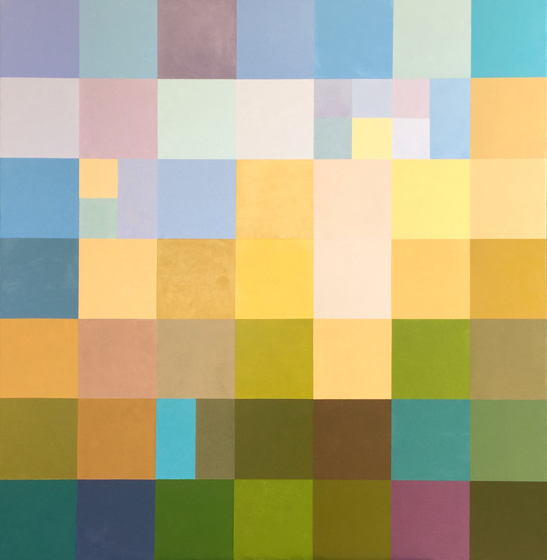 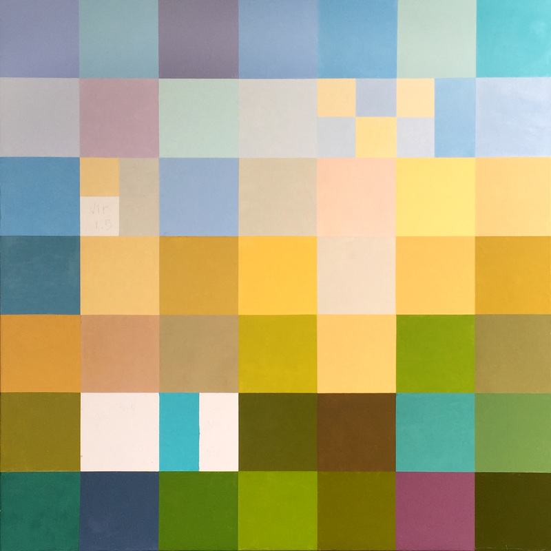 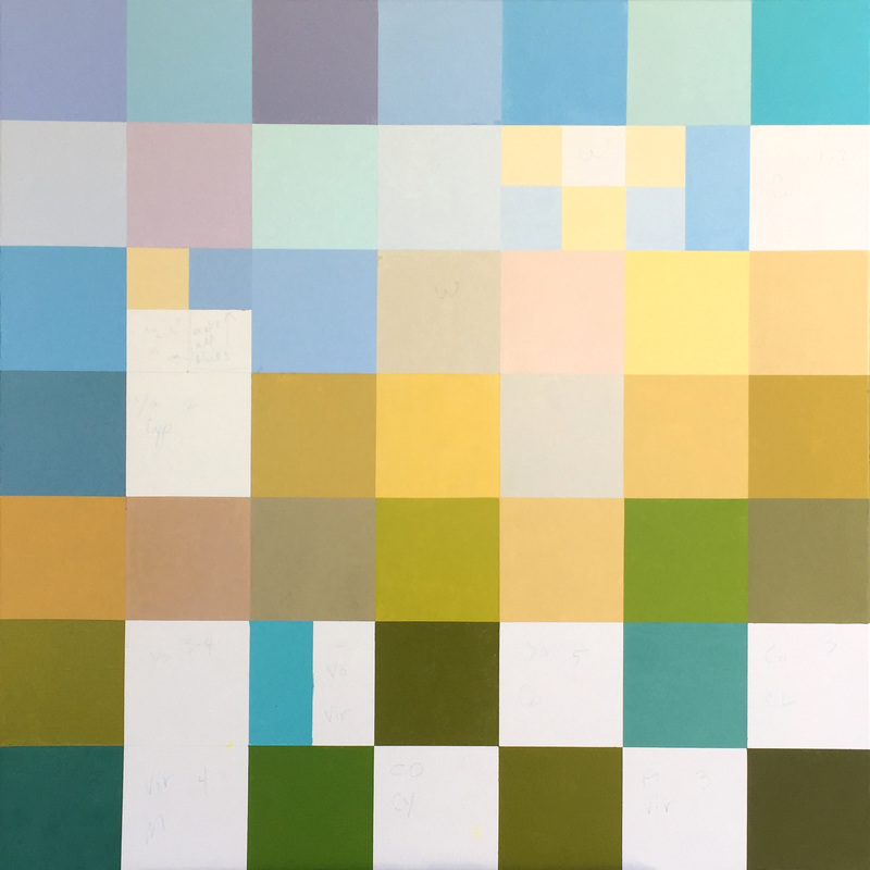 Here are some very beautiful colors, blues, viridians, turquoise and mixes of blues and yellows for a variance of greens. The soft pinkish hue , 3rd from the top and 3rd from the right, is yellow ochre mixed with terra rosa.
 Because of drying time, sometimes I can add only a few new color blocks. This is coming along very pleasing to me. The greens are not in your face. They are natural, of nature. Many greens right out of the tube are too over colored for my work. Except for the viridian on the lower left corner, I mix all my greens as I did for my landscapes.
 I don't always know what I am going to paint, what the subject, if any, will be, or even the feeling . However, this painting, Rancho Bodega, is a place. My husband and I attended an epic birthday party in late June on the private property of our friend. We and many others camped over for 1 or 2 nights with all the expected party festivities. It was not disappointing. We were in the middle of redwood groves and native ferns, creeks, open fire cooking and fun, warm hearted people. I went for a walk the first morning and wandered along a typical California golden field, a soft, pale gold appreciated the way only a Californian can. The sun shone from a blue laden sky upon me, the field and the oaks and other wild growth. It was affirming. I was alive in a gracefully elegant place, and made a note to myself of how I wanted to paint that memory. Blues, golds and greens. I missed the first couple days of capturing the progress with my phone, but here are 2 painting days with more to follow.  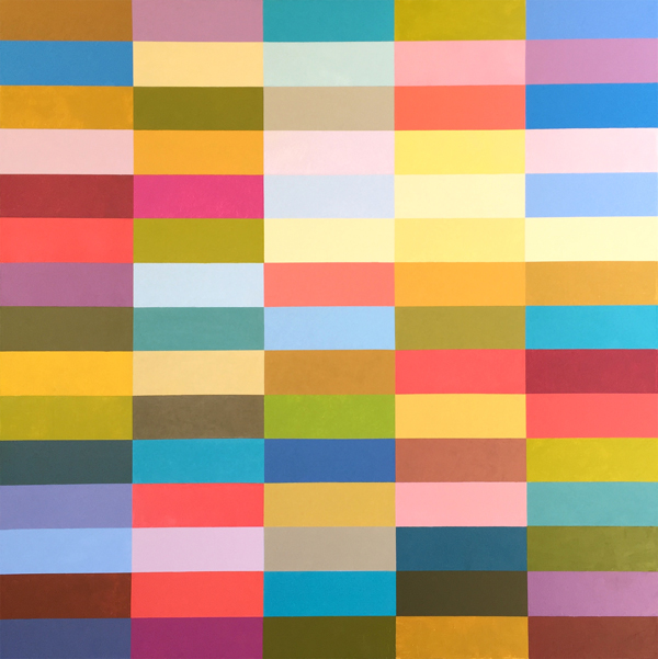 Today I completed my latest painting. I have not yet titled it, as it has no prevailing thought. It is a color exploration based on the previous "California" oil painting. The colors feel agricultural and warm, feeding me and my love for summer. What does it feel like to you?
 I am continuing the progress on this painting which does not yet have a title. The painting has a number of slight adjustments to be made, so I won't post it again until it is completed. It has a few of things that are not working, but I am really happy with the energy and the colors that are emanating and the course that the color harmonies have directed themselves. When I see the digital image, it is far more harmonious than the painting is in person. The darkest dark on the left is just too dark, and it is adjacent to a pale yellow ochre. The contrast is too eye catching. I don't want that area to be the focal point. In fact, this painting is so radiant that I don't want an obvious focal point, but only for the eye to travel and rest.
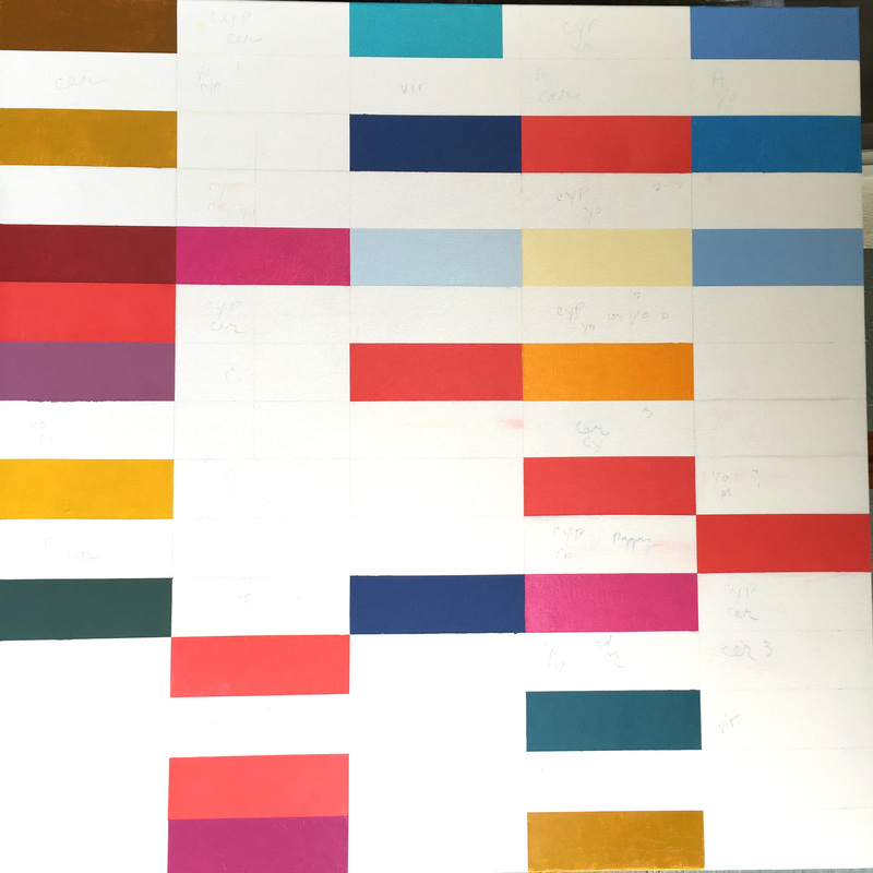 I managed to gather a few more images together from preceding days of painting. You can see that I sometimes change a hue in the middle of the process, but usually I wait to the end to change a color that has already been painted. The reason being that it sometimes works out perfectly, and I need to look at the whole canvas before making such changes. I have to say, the deep blue color blocks in the center column are really bugging me, and I sense a change coming on real soon. 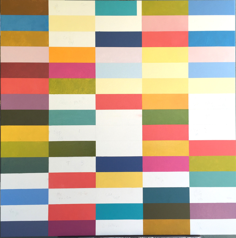 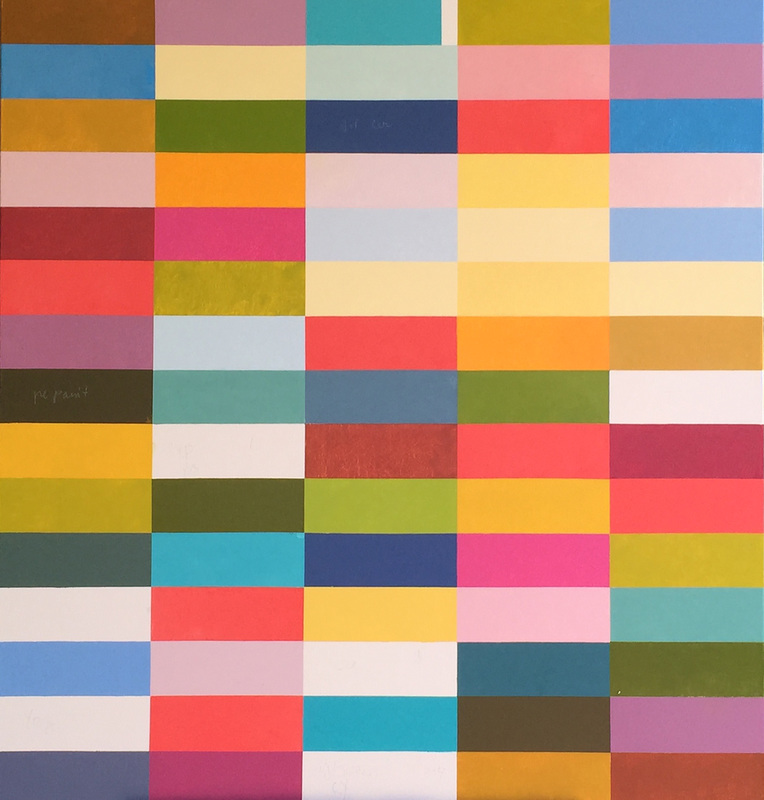  This painting is really moving along. I am very disappointed that technically I experienced some problems and was not able to properly save the images of each day's progress. It is a really fun painting to work on, and I am enjoying how the colors stack up in different collections of warms and cools. I can see creating more of these and have plans for a couple specific ideas where the striation would be effective.
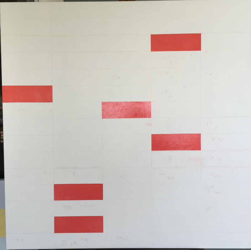 The images above and below show the initial progress on the painting I am currently painting. It is a departure from the square color blocks that I have been creating. It should be interesting to see how the drawn out rectangular shapes effect the composition and how I will go about making my choices of color. The cadmium red is painted initially to be certain that I thoughtfully break up the composition. There is no other known intention here other than the fact that I enjoy using this particular hue of red. 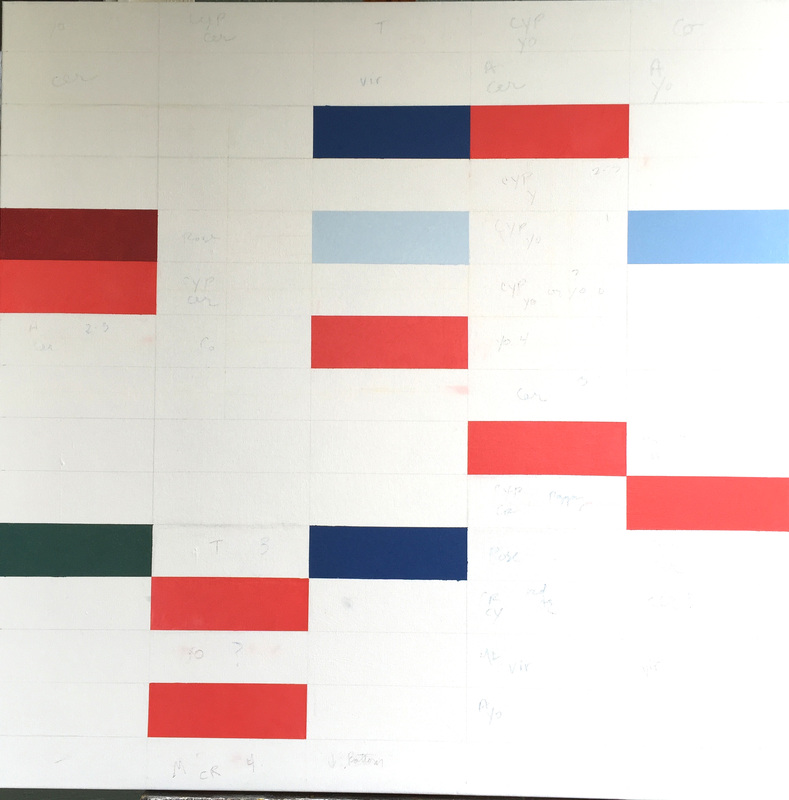 |
Luminous Color Explorations
My name is Jill Keller Peters, and I am passionate about using color as a language to Archives
August 2020
Previous Archives
|
 RSS Feed
