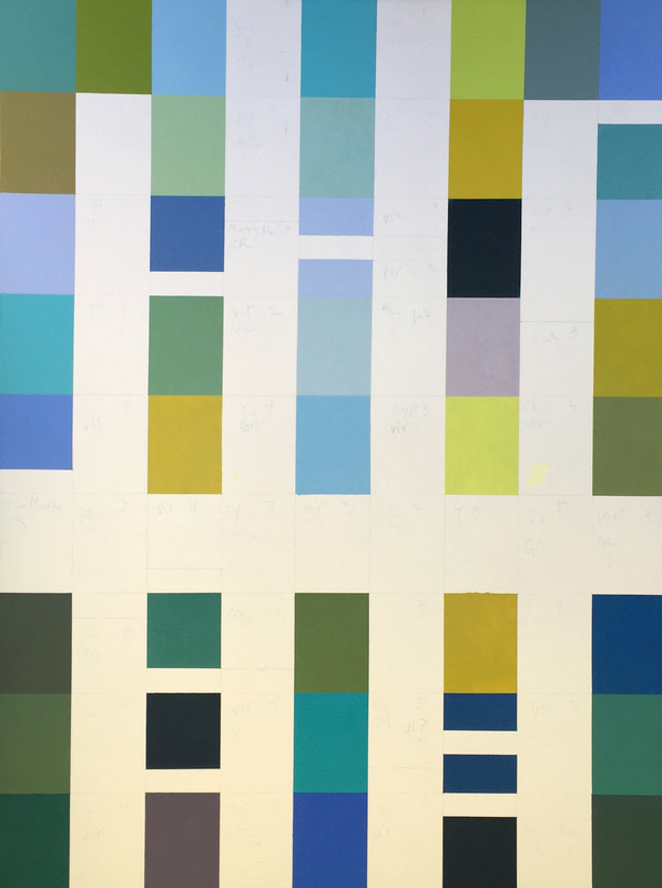
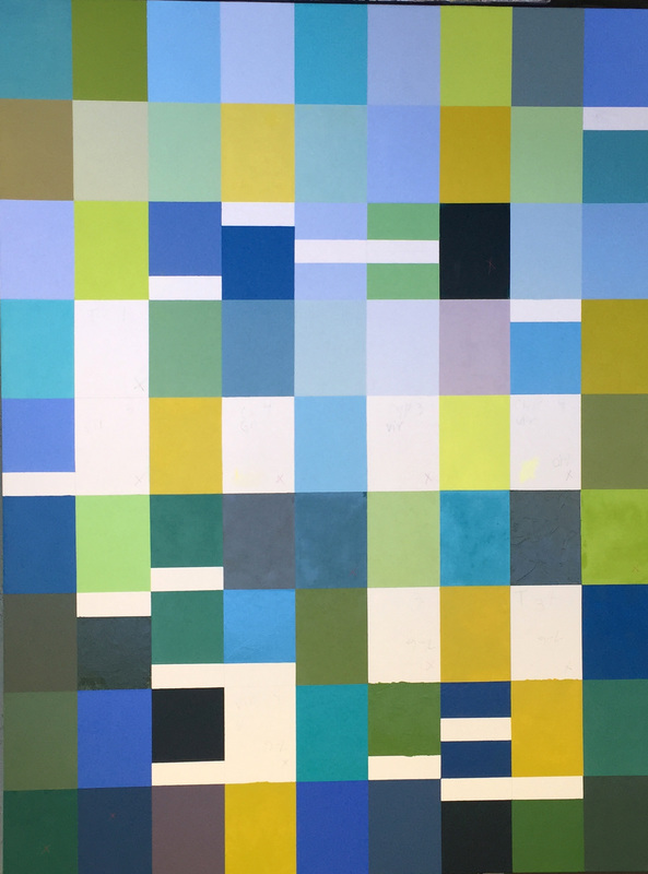
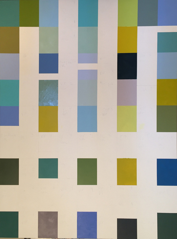
"Hyannis Port" Color Field Oil Painting, (formerly called Blue-Green Oil Painting in Process)8/17/2016 I have completed the "blue-green" painting. It matches with the feeling that I wanted to project, a lovely, sunny day on Cape Cod: The light, the sun and water and the salty quality of the air. I made a number of changes on it at the end, an agonizingly slow process. I have to have a lot of patience toward the 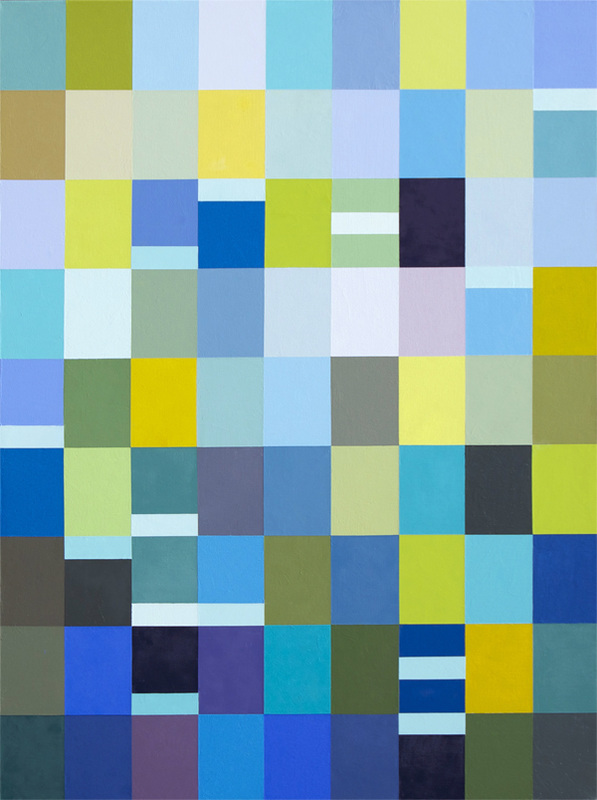 Hyannis Port, oil on canvas, 48" x 36" conclusion of many of my paintings because it's natural to want to resolve all the imbalances and harmonies when something seems off. I'm really happy with it. Please Click on each image for an explanation of the final changes below. Abstract oil painting, color field painting, modernist painting, fine art, interior design, home decor
0 Comments
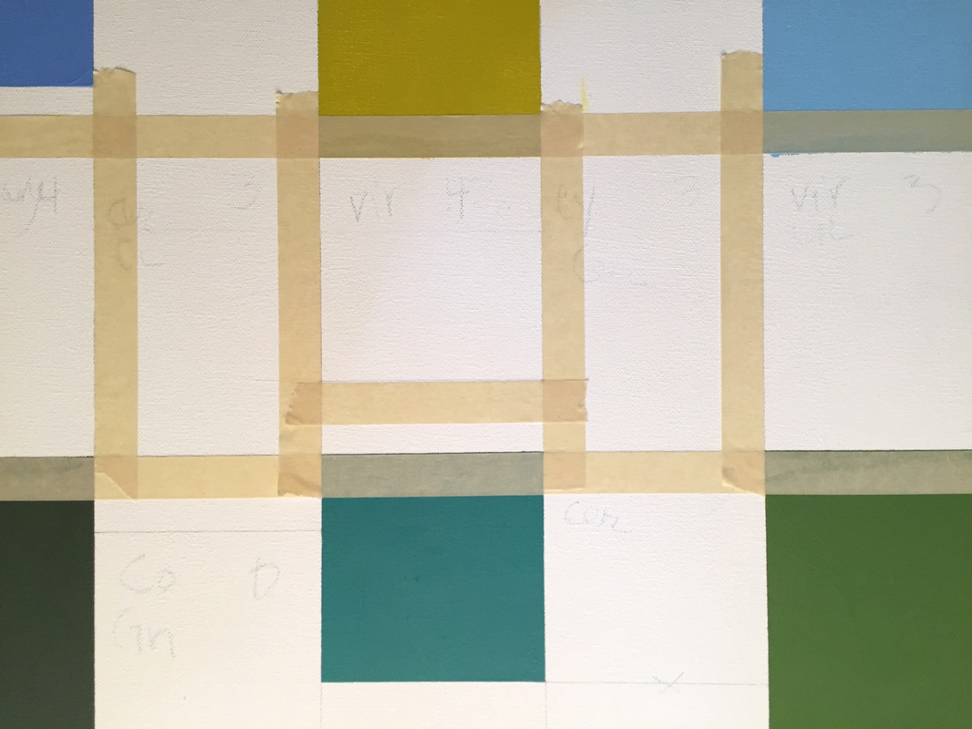
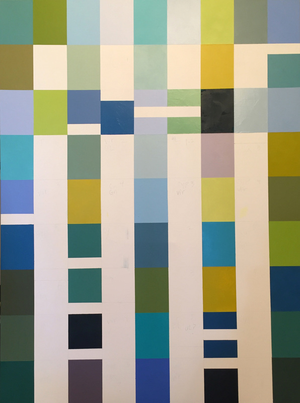
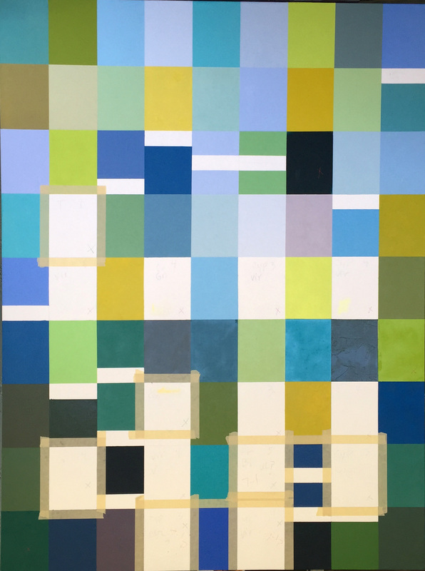
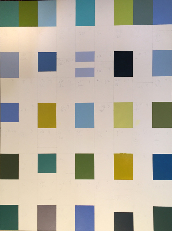
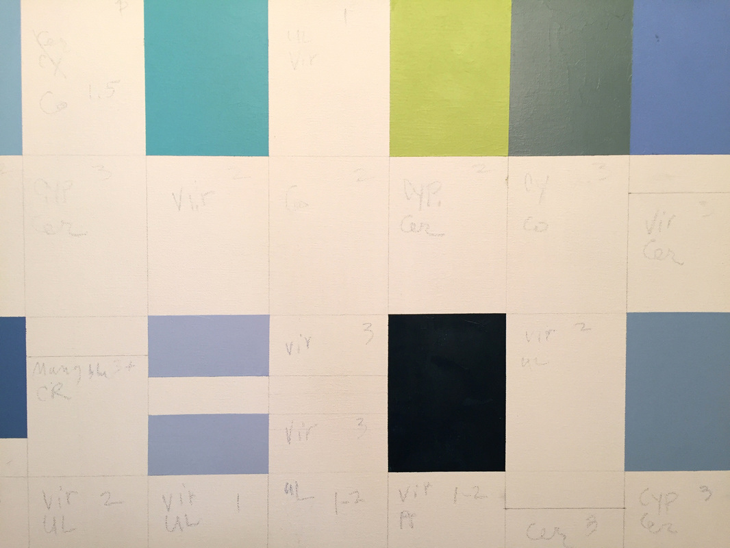
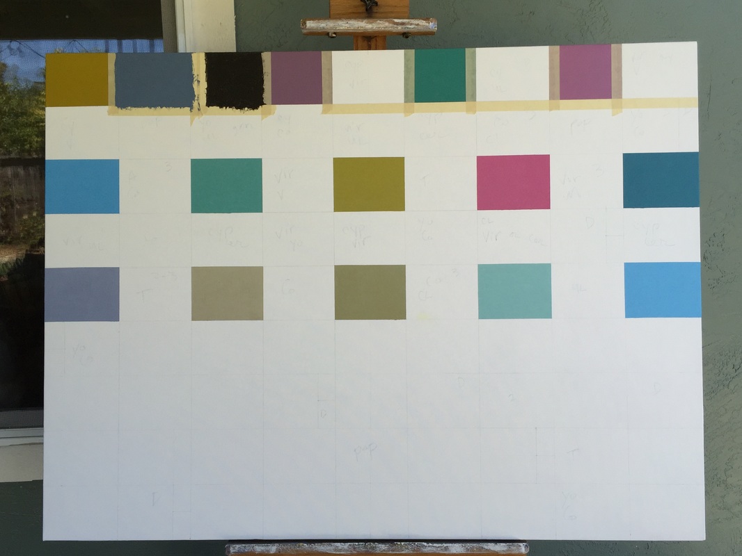
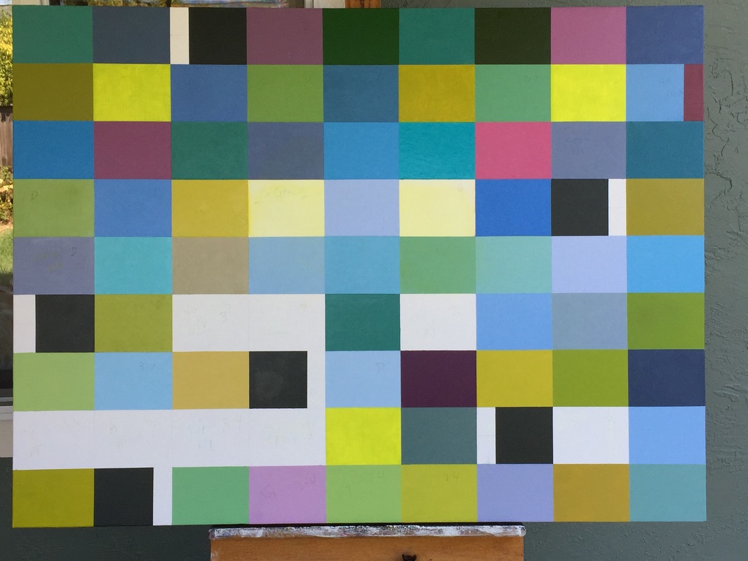
Below you can see my progress of the painting. I shoot the daily progress with my iphone and have only done the slightest bit of photoshopping here. I'll photograph the finished painting with a proper setup when the painting is completed, and the lighting will be even and the lines all straight. Please click on each image for detailed information. Thank you for checking in on my progress! The most challenging part of the painting is coming when I make it all work in harmony. I will post the headway in another week to ten days.
Blue-green oil painting in progress, 48" x 36" modernist oil painting, oil painting in process, color block painting, color field painting I started a new painting in mid June, just after returning home from Cape Cod. While we were walking there on the beach on a sunny afternoon, I snagged a lounge chair, put my feet up and closed my eyes. I experienced those patterns and images that happen when you tilt your head up to the light with your eyes closed. It was full of brilliant patterns of greens and blues and... became the inspiration and color for the current painting that I'm working on. The images above show the progress I made in a week, working within the limitations of my painting process, allowing drying time. I work on other paintings in between times. The images are just barely edited, and are photographed with my iphone. I'll show more progress next week. Thanks for stopping by!
Please click on each image for detailed information. modernist oil painting, oil painting in process, color block painting, color field painting 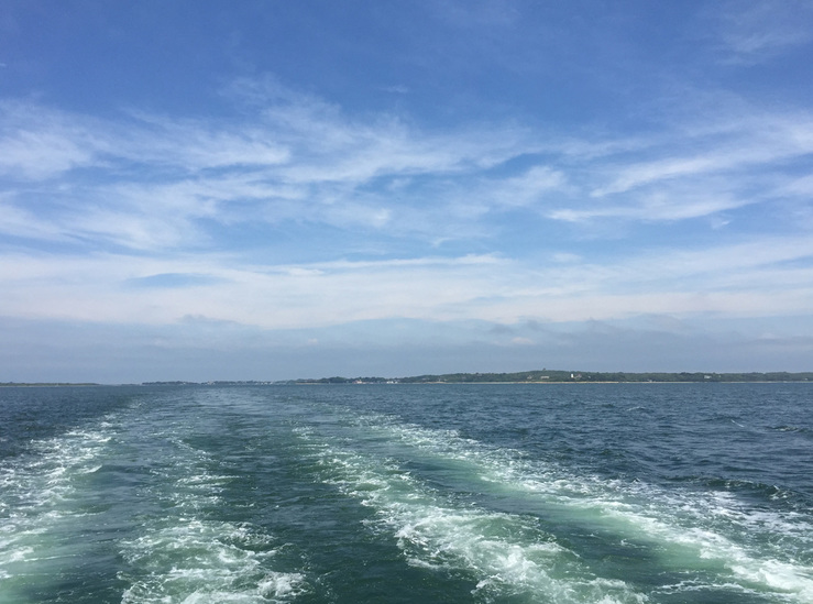 Wake of the ferry from Wood's Hole to Martha's Vineyard When I am on a get-away I seldom spend much time making art, unless I'm at a workshop. I always bring a sketch pad, pens and colored pencils, and I have a number of sketchbooks that contain many travel scenes from the past. However, I live and breathe art making and art business in my every day life, and I relish it. For now, when I travel I seek to quiet my mind, to give myself permission to taste and see my surroundings, and be in the moment of what I am experiencing. As much as I am grateful for each far away scene I have drawn, I am just as happy for the experience of stepping into the now and drinking it all in.
I struggle in leaving home, leaving my art projects, all the ideas for a painting that I want to give shape and substance, and everyone who I want to reach and share it with. I left it all in trade for my vacation. "Taste and see" were the words that I heard from my muses. I tasted plenty . . . lobster rolls, lobster prepared different ways, truly, I got lobstered-out, fun food, like onion rings, haddock, just off the pier, a highly under rated, delicate fish, the affable Bostonian accent that I first heard from John F. Kennedy as a child. Licorice, not the rope variety, but the little shaped kind that you buy at the shore, or in this case, the Cape, Cape Cod. We went just before the summer season opened, so it was not crowded, and still pretty chilly, but beautiful. Quiet, vast, unfilled space, only the sea and the sand in my view. Long walks in the sand, sand everywhere, sticking to shoes and clothing, sweeping it out of the bed sheets. How fortunate I am for this kind of time, this restoring and nourishing time and with wonderful company. modernist oil paintings, color explorations in oil 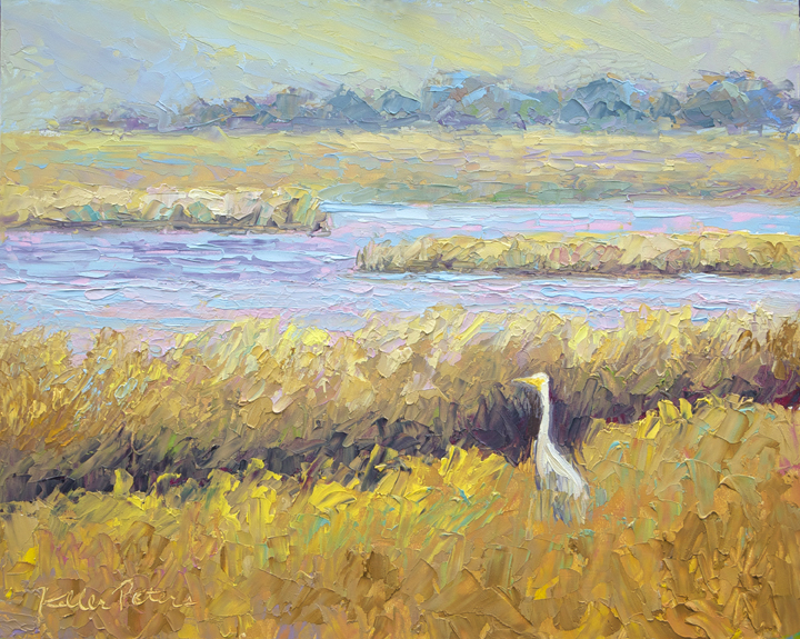 Egret - Tomales Bay, Oil on panel, 8" x 10" This was one of the most fun paintings I have done for a while. I always love the process of painting, and lately I have created a great deal of modernist works. The modern works are very important to me. They challenge my sense of balance, harmony and design as well as a certain cerebral component that I cannot articulate. At least not today. And while painting landscapes is not simple, it is just fun for me to paint a creature, a lovely bird, a frog, a bug. And it feels safe, like climbing up into my mother's lap.
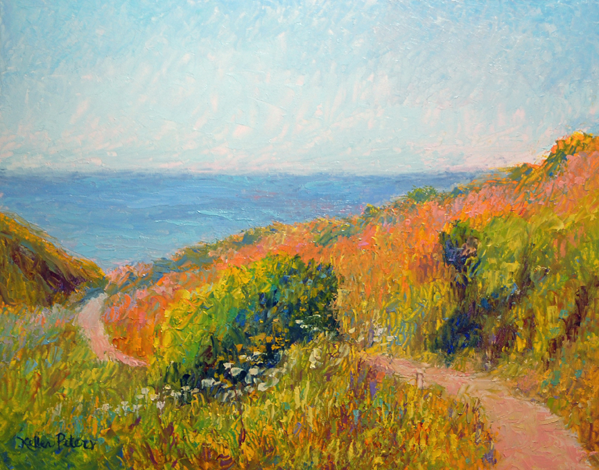 First Date - Bodega Bay, Oil on panel, 8" x 10" "Life is a matter of being born; but Art is a question of being alive." - E. E. Cummings I have a new show coming up at the Dutton Goldfield Winery. It is a collection of many places I have traveled to, and more importantly, subject matter from Sonoma County, where I live. Here I am calmed by the exquisite wide-open spaces of the countryside. The moving lines of the hills, the fragrance of the orchards and vineyards, and the history of hardworking farmers and ranchers influence a love of organic beauty in my contemporary impressionist oil paintings.
Come to the Artist reception on Sunday, May 22nd! The Landscape Show Dutton Goldfield Tasting Room May 19 - July 18, 2016 Artist Reception: Sunday, May 22, 1-3 pm 3100 Gravenstein Highway North, Sebastopol, CA 95472 707 823.3887 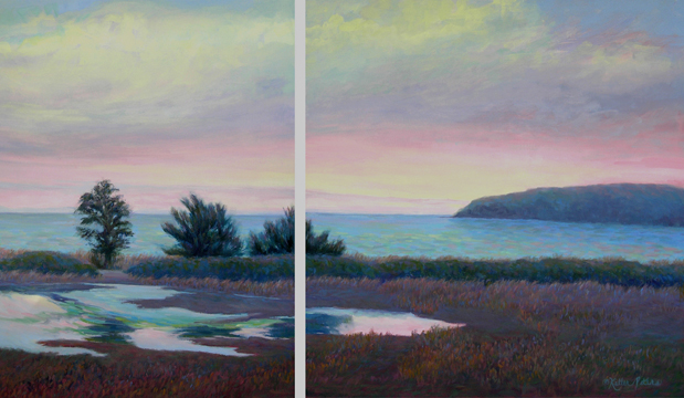 Yin Yang - Bodega Head, Oil on canvas, diptych, 30" x 54" Painting and art creation began as a creative practice, and they are the cake and icing of my life. The tricky part, as everyone knows, is the "going to work" part, getting beyond being in touch with my inner child, and cultivating business practices and disciplines, the Yin and Yang. Personally, I think it's grand to have that push-me-pull-you kind of life. The creativity ebbs and flows and the reality of doing business and living artfully come equally into play. Living artfully is learning the skills to play the game, to gracefully move from painting and creating to chauffeuring kids, to doing bookkeeping, cataloging and marketing, to calling a client or a colleague for a meeting and showing up to support artists and galleries at an opening. It is lovingly making dinner and taking it to someone. It is sitting patiently and waiting. The Yin Yang impressionist oil painting is part of an exhibit opening on May 19 at Dutton Goldfield Winery. Dutton Goldfield Winery May 19 - July 18, 2016 The Landscape Show Artist Reception: Sunday, May 22, 1 - 3 pm 3100 Gravenstein Highway North Sebastopol, CA 95472 (707) 823-3887 Open daily 10 am - 4:30 pm I have been greatly honored by Satri Pencak with her eloquent words and unique understanding for the artist. Please follow her blog to learn more about Sonoma County artists! 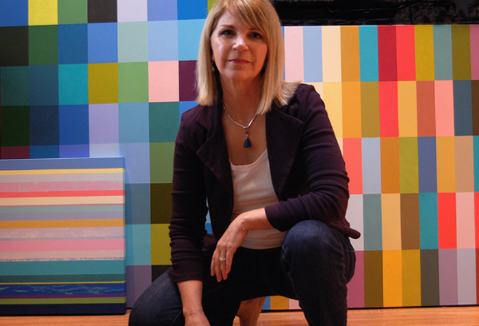 " style="width:auto;max-width:100%" /> " style="width:auto;max-width:100%" /> Jill in her studio When you look at a sunset, how many colors do you see, how many shades of pink or blue? What color is the rain, or the feeling of gladness? Artist Jill Keller Peters addresses these questions by using color as an expressive language. Her current oil paintings are color abstractions that could be more closely described as color-field painting. Jill calls them color explorations; color being her most important and most powerful communication tool. She says “I express and develop a language with my work through color.”
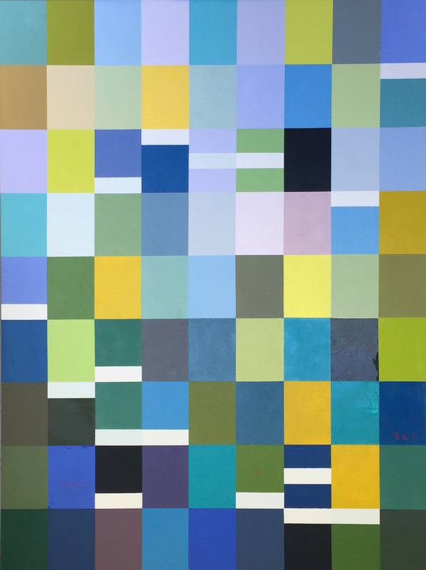
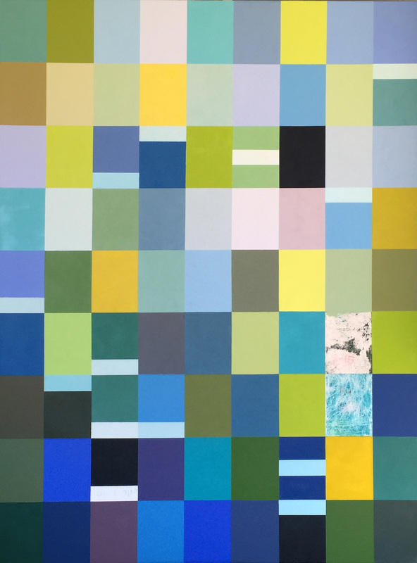
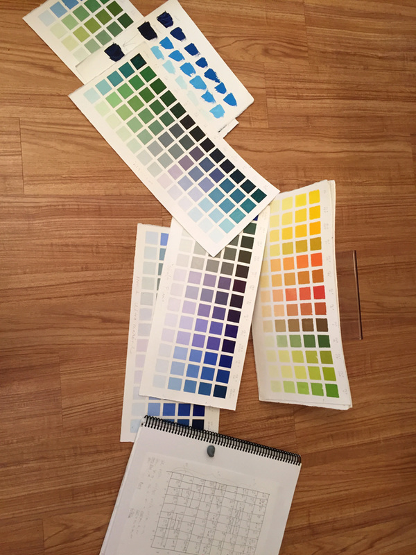
Prior to delving more fully into abstraction, Jill had a long career as a painter of impressionistic landscapes, and in many ways her abstraction series is a natural extension. The colors and landscape elements have been distilled into blocks of precisely chosen colors that are carefully arranged in relationship to each other. This transition in Jill’s style reflects the influence of paintings she has seen and been deeply moved by. Her recent work combines the Bauhaus design elements of artists such as Josef Albers and Paul Klee, with the colors and mood of Claude Monet’s gardens and ponds. Jill says “I am inspired by the colors of nature, and by emotions, thoughts, and feelings.” Through her paintings Jill’s intention is to express intense feelings such as love and joy; or the feeling of the air, color, and sound of walking on the beach on a particular day. The paintings also create a visual environment that can be felt and experienced, invoking feelings of vibrancy or tranquility in the viewer. Jill has lived in Sonoma County since 1978, and she appreciates the exquisite wide-open spaces of the countryside. She says that “The moving lines of the hills, the fragrance of the orchards and vineyards, and the history of hardworking farmers and ranchers influence a love of organic beauty in my work.” Her current exhibition, Choreography of Color, an exploration of the rhythms and movements of color created to express states of wellbeing and wonder, is on view through April 30 at The Passdoor, in Sebastopol, 6780 McKinley St., #150, the Barlow, 707-634-0015. A showing of Jill’s landscape paintings will be on view May 19 through July 19 at the Dutton Goldfield Tasting Room, in Graton, 3100 Gravenstein Highway North, Sebastopol, 707-823-3887. You can see more of Jill’s artwork on her website, http://www.jillkellerpeters.com 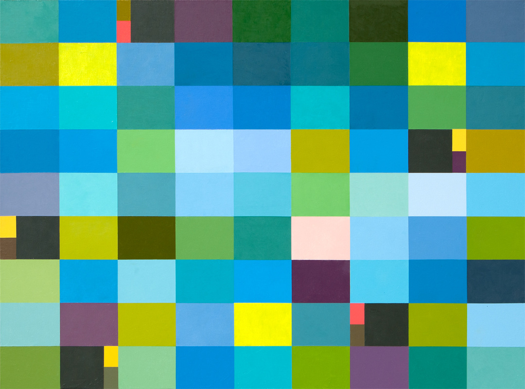 Blue Pool, Oil on Canvas, 36" x 48" The title of this modern oil painting is Blue Pool. This painting began with an idea to study blue-greens. It is painted with sometimes viridian alone and mixed into many of the hues as well . It's one of my favorite colors to work with because the color itself is rich and jewel like. Used wisely it takes a back seat to other more intense and clear hues, yet it holds its own so elegantly. The lovely violet hue in the painting is a mix of viridian and magenta and many of the green-blues as well. I use alkyd oil paints to amp up the drying time, so that I can mask each of the color tiles as needed to paint the adjacent rectangle. And the paint needs to be tough to take that kind of abuse. As I continued to work on this painting, balancing the color design and the weight of the piece, I imagined water and reflections on the water, reflections of the sky and surrounding plant life. The water is moving softly, sparkling and lulling at the same time. Tranquil, like looking into a deep, blue pool. Below you can see the painting progression of Blue Pool. 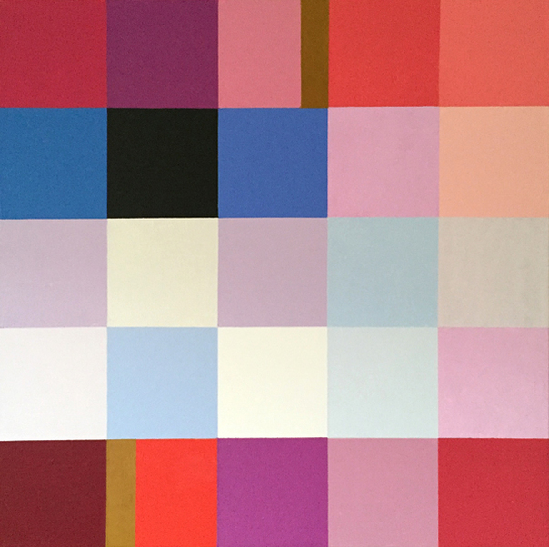 Unexpected Bliss 1, o/c, 20" x 20" Above and below are the completed paintings, Unexpected Bliss 1 & 2, and they are among my favorite works. I really enjoy the reds and their supporting colors. There's nothing like when we allow ourselves to run with our hearts, and achieve the results we were hoping for. I can see expanding on this theme and creating larger variations. 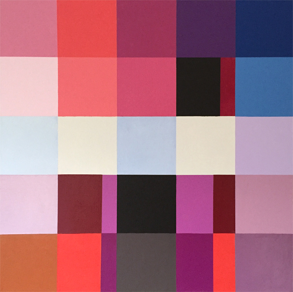 Unexpected Bliss, o/c, 20" x 20" Below you can see the progression of the paintings. The development is abbreviated, but gives a clear idea of my steps. All joy! 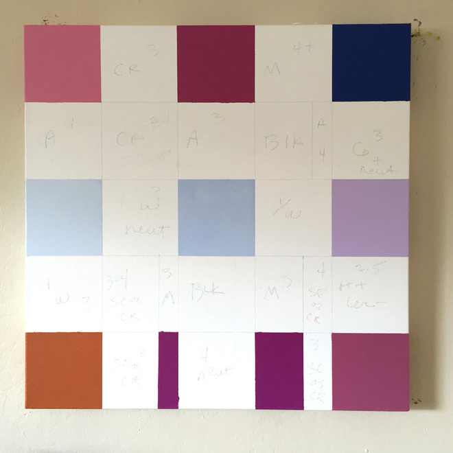 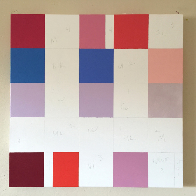 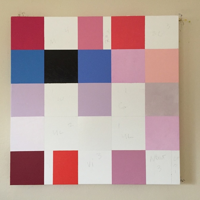 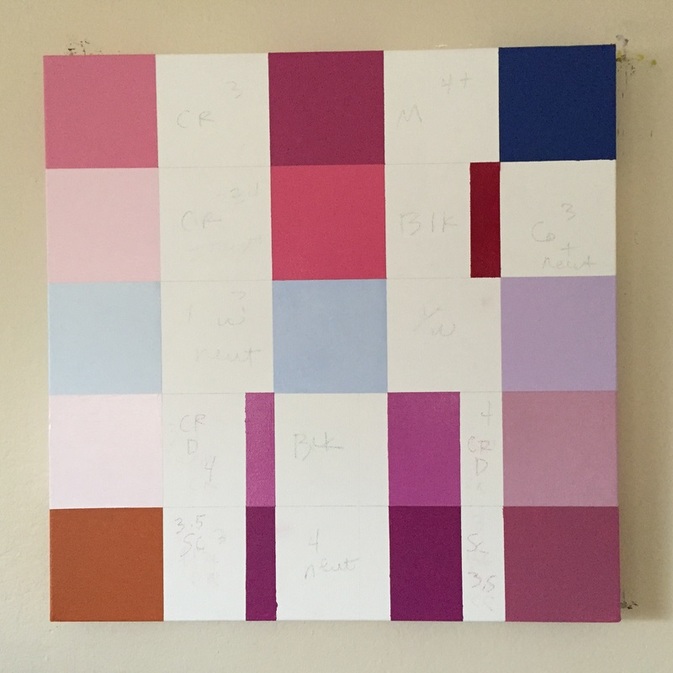 |
Luminous Color Explorations
My name is Jill Keller Peters, and I am passionate about using color as a language to Archives
August 2020
Previous Archives
|


 RSS Feed
