|
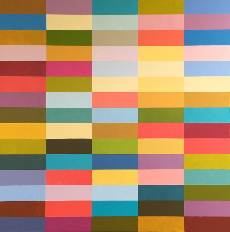
I am continuing the progress on this painting which does not yet have a title. The painting has a number of slight adjustments to be made, so I won't post it again until it is completed. It has a few of things that are not working, but I am really happy with the energy and the colors that are emanating and the course that the color harmonies have directed themselves. When I see the digital image, it is far more harmonious than the painting is in person. The darkest dark on the left is just too dark, and it is adjacent to a pale yellow ochre. The contrast is too eye catching. I don't want that area to be the focal point. In fact, this painting is so radiant that I don't want an obvious focal point, but only for the eye to travel and rest.
0 Comments
Leave a Reply. |
Luminous Color Explorations
My name is Jill Keller Peters, and I am passionate about using color as a language to Archives
August 2020
Previous Archives
|


 RSS Feed
