|
When I am at my desk organizing my life and looking up dates, I become a little impatient when I have to stop and check the calendar on my smart phone or desk computer, because doing so requires so many steps . . . . Last year I was gifted a narrow art-filled calendar that hung on a tiny nail near my desk. I loved using it and found that it much more easy to glance over to my right to reference a date, say, Tuesday the 19th, to see what day of the week it fell on.
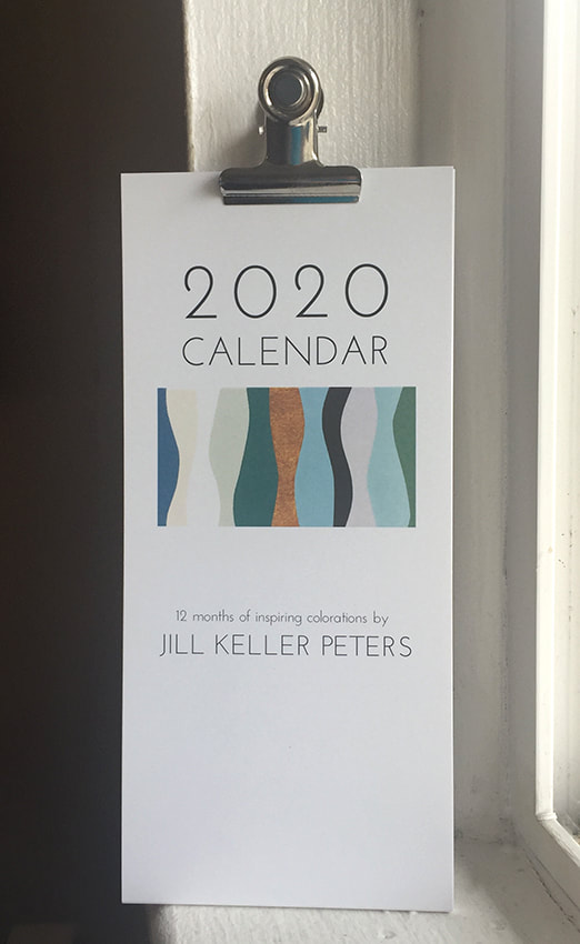
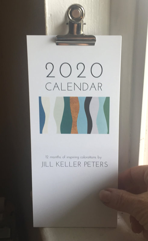
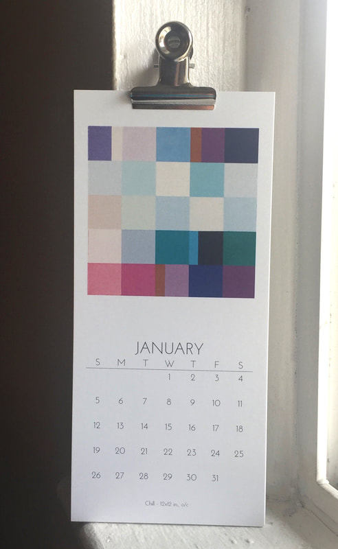
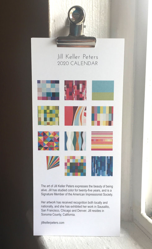
This year I decided to design my own narrow art-filled calendar for 2020 and share it with the public for purchase. It also seemed like a good idea to use it promotionally and give a calendar to my art collectors, and gallerists, and all who have supported and encouraged me over time, especially during the past year. I am not a graphics designer, but I do edit photos in photoshop and create layouts for postcards, newsletters and marketing pieces in inDesign. For the most part I have always enjoyed the process. So, it's official. The coming year, 2020, has birthed a new calendar that contains twelve months of pages in contemporary style colorations from images of original oil paintings that I have created this year. I wanted the content to invoke optimism with each passing page, to brighten up a space and help a fellow human being stay present and organized. It's fun to find what lies behind each calendar page, what will the next month look like? Will I like July as well as June? That's what I wanted to create, the particular pleasure of turning the calendar page and seeing a new delight. I have studied color for twenty-five years, and utilize its power to express the beauty of being alive. How perfect it is to inspire others in the form of a calendar. Share the joy of now, of color, and of connection with friends and family with Jill Keller Peters’ Art Filled 2020 Calendar. 7.75” x 3.5”, fastened at the top with a magnetic metal clip.
2 Comments
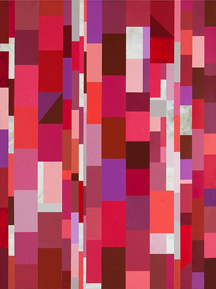
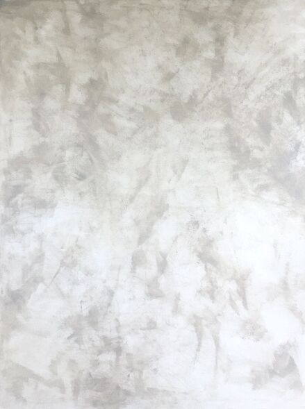
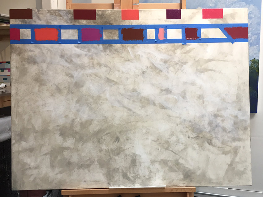
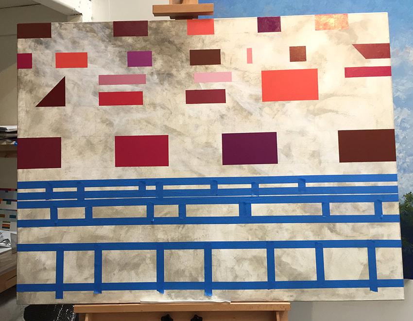
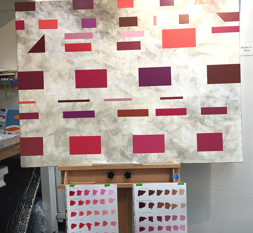
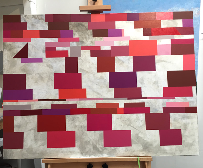
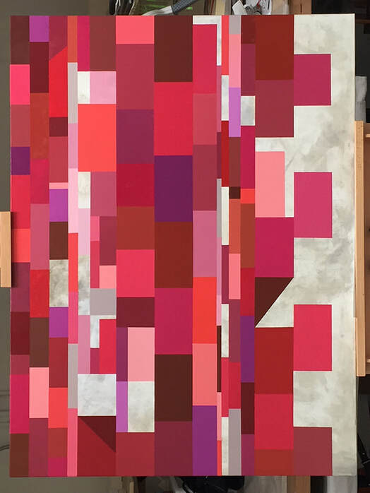
Synergy is an epoch, intuitive painting. Oil on canvas, 48 x 36 x 1.5 in Part 1: Synergy was not planned. It just happened. The underpainting for Synergy was a personal painting that I quietly titled Smoke and Ash (below). Meaning, it was never meant to be seen or exhibited, because it was too tender and a very personal painting. It is my memory of the Tubbs fire, standing out in the street with my neighbors in a fog of swirling smoke and ash that left my legs feeling weak. I created this painting a couple weeks after the fire and felt myself lost in the fog. Part 2: The painting was stored in my shed until a year and a half later when I decided to create a painting in all red hues, an inspiration from a blog sent to me from Gamblin Artists Colors. Consciously, the painting of reds had nothing to do with fire, more a thing of passion, focused on spending time learning about interactions of Reds. I worked horizontally and intuitively on the painting with an intent to paint the reds in a way that they would move spatially on the plane of the canvas. Although I had an intimate memory of painting the underpainting I didn't really think about the previous content of the smoke and ash at the time, but more that it was making a very interesting background in the artwork, and that I wanted to include it into the composition. The Reds came began to describe a new strength, new curiosity and an unstoppable energy. I didn't do it, not out of consciousness, but out of my interaction to the paint. Eventually I switched to working vertically, filling in shapes of various sizes and hues to create interest and space, sometimes regretting losing the under layer. Epoch - Marking a place in time, a division of time. Synergy - Cooperative interaction. Synergy is currently exhibiting at Fulton Crossing Gallery November 1 through December 29 and is available through the gallery.
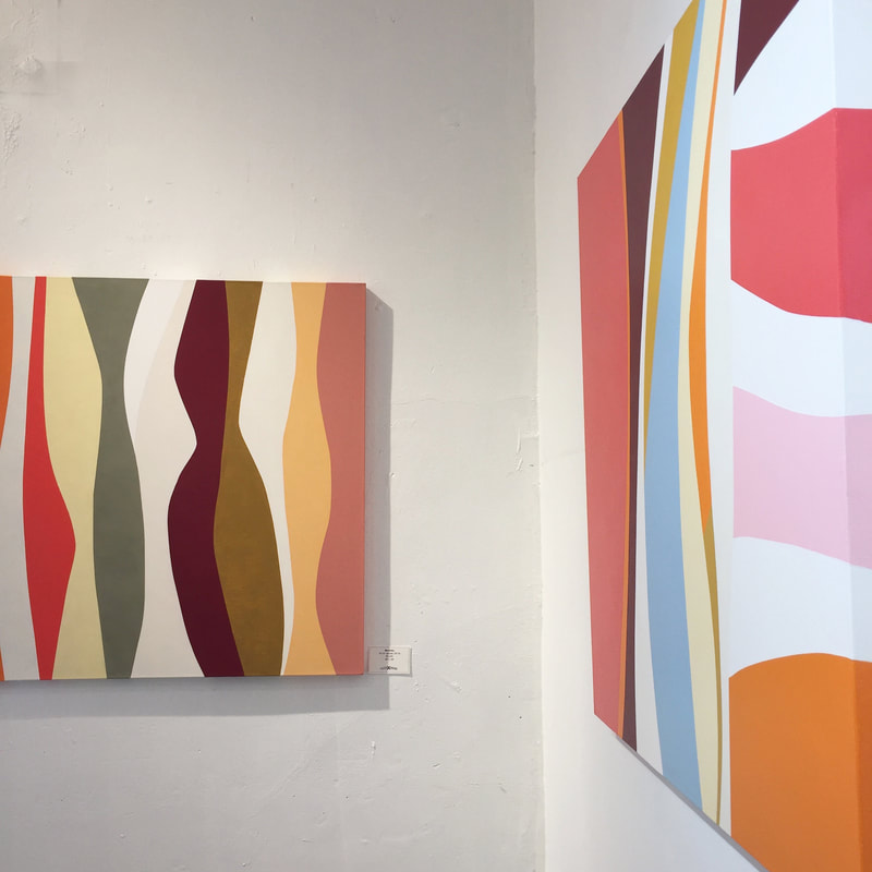
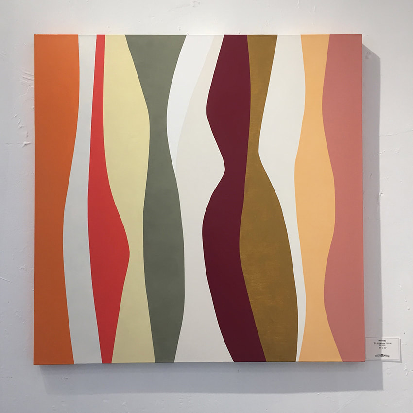
I discovered a new method of working with paint and tape this year that really resonates with me. I sought to learn how to paint lyrical hard edge curves that are both lyrical and intuitive. I don't lay out a design, but have an idea of movement in my head and pull tape across the canvas in a shape that I respond to. I paint the first curve shape and continue from there. The trick is that I cannot paint an adjacent shape until the first is completely dry, and since I paint in oil, it is often at least three days before I can proceed. Marimba is about the sixth painting that I have created in this approach. I love it's sensual movement and and rhythms. I particularly enjoy the subtle tonal differences between the white and off-white curves at top center. I can see many color palettes and individual wavy shapes that could be painted in this languid ambiguous style. Marimba is currently exhibiting at Fulton Crossing Gallery November 1 through December 29 and is available through the gallery.
|
Luminous Color Explorations
My name is Jill Keller Peters, and I am passionate about using color as a language to Archives
August 2020
Previous Archives
|
 RSS Feed
