|
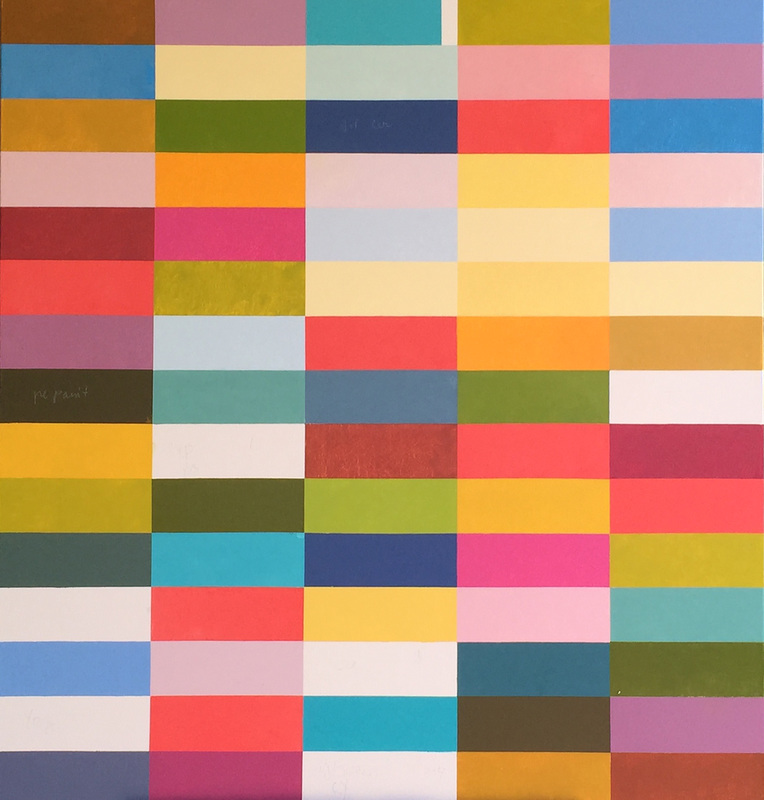
This painting is really moving along. I am very disappointed that technically I experienced some problems and was not able to properly save the images of each day's progress. It is a really fun painting to work on, and I am enjoying how the colors stack up in different collections of warms and cools. I can see creating more of these and have plans for a couple specific ideas where the striation would be effective.
0 Comments
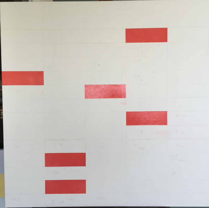
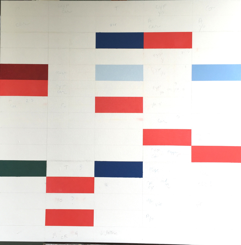
The images above and below show the initial progress on the painting I am currently painting. It is a departure from the square color blocks that I have been creating. It should be interesting to see how the drawn out rectangular shapes effect the composition and how I will go about making my choices of color. The cadmium red is painted initially to be certain that I thoughtfully break up the composition. There is no other known intention here other than the fact that I enjoy using this particular hue of red.
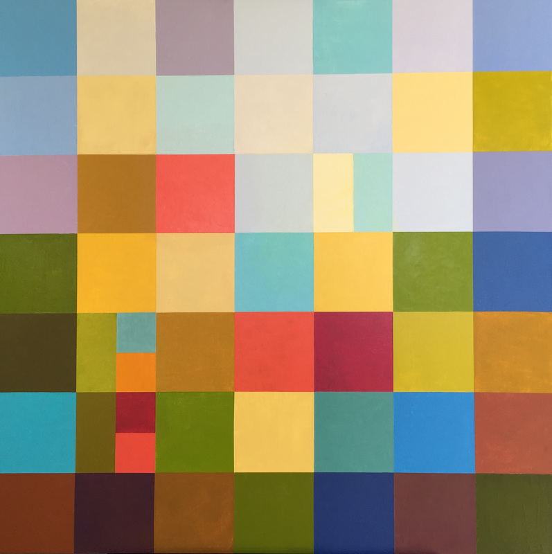
I grew up in central California, practically right in the middle of the state where those who lived there were surrounded by fields of alfalfa and cotton, walnut orchards and fruit trees. In the distance was the Sierra Nevada, softly blue, lying in her majesty, and where my family drove to camp outdoors many times. These 54 squares state my thoughts and love for California, the rich, loamy soil, redwood trees and occasional painted skies, my home.
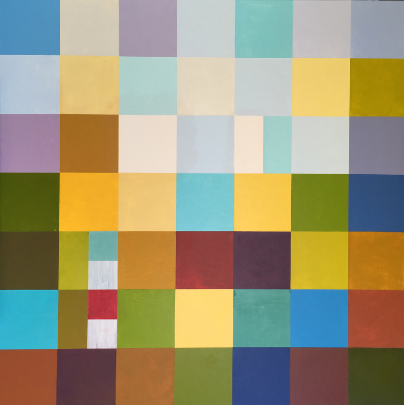
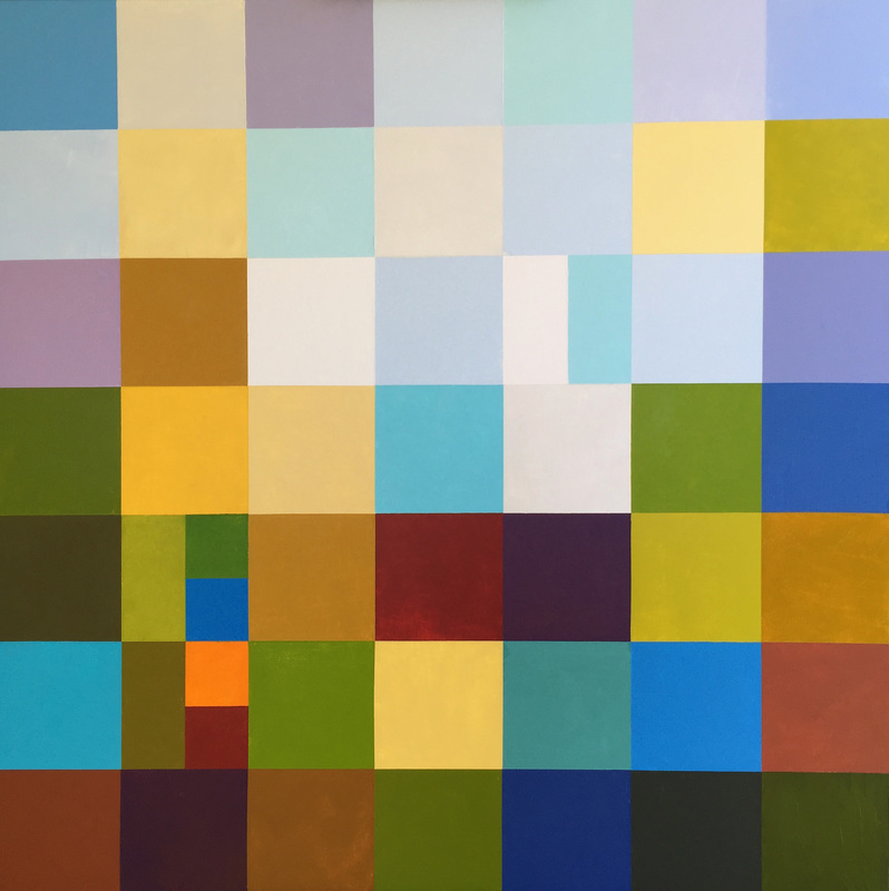
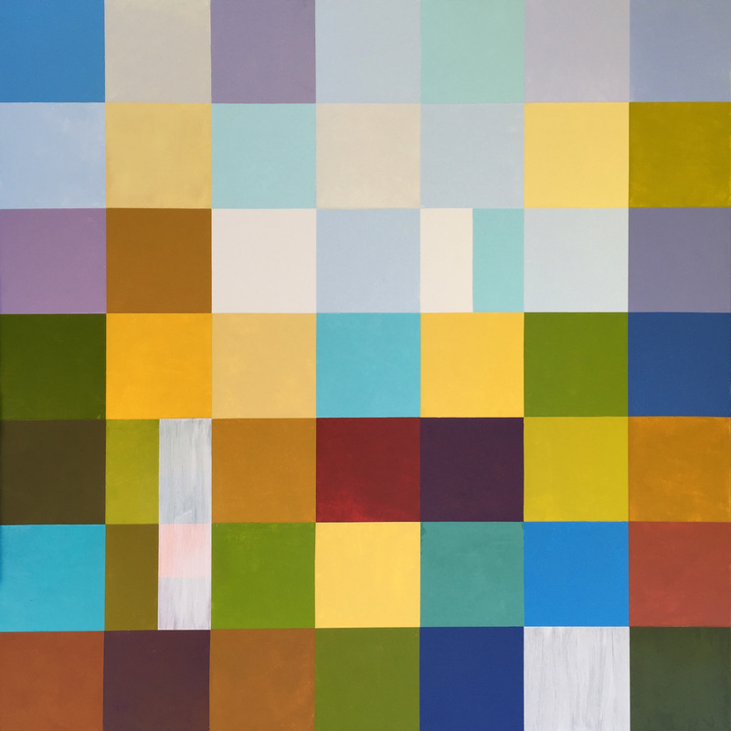
I changed very little this time. At this point in the process, one cannot work too quickly. One cannot force it. All I did was add paint to the gessoed areas from last session. I added Viridian and Alizarin/Yellow Ochre to the vertical strip and a Magenta/Yellow Ochre/Alizarin to the bottom right spot. So far, I feel that the painting may be going in a better direction. I look at it and still ponder if it will be transported into a work that I really love.
I promised that I would write about what it means to "trust the process". For me, it means to go back to what I know is true. Review the teachings that I follow every time I stand before my canvas or sketch pad. It has to do with how I mix my color, and the way that I place certain colors in a composition, varying as much as possible while keeping it harmonious. Occasionally it means keeping some areas quiet, even though it would look so attractive to show off a couple of colors that look smashing together. So many times I just don't know, and it is hard to see the next step. From time to time I even build the composition intuitively as I go and feel quite insecure until, once again I ask myself these questions: What am I trying to say? How can I best show that concept? What do I already know to be true? These questions offer the road to my authenticity and the final outcome of a painting. Now that I am progressing further into the painting I am challenged to make the top and bottom of the painting relate better to each other. Quite honestly, I am scratching my head, as I was believing from past experience that it would come together more easily. I will figure it out in time.
As you can see below, I sanded and painted gesso on a couple of the blocks that did not look right to me. The bottom right block was too dark, and the 4 blocks running together were too bright, and inconsistent with the painting. And lastly, I painted the block to the right of the central turquoise a soft, Tuscan tone. It adds warmth to that row and more separation to the white and turquoise block above it. Nearly every painting comes to this place of question marks. What do I do to make this work? The harder I think about it, the more the answer evades me. I stop and remind myself how often I have been in this spot, and how, if I trust the process, I will find it. Just what is this place in the process? Hmmm. To say it in words will take some drafts. I'll work on it and present it as best I can in the next blog. |
Luminous Color Explorations
My name is Jill Keller Peters, and I am passionate about using color as a language to Archives
August 2020
Previous Archives
|
 RSS Feed
