|
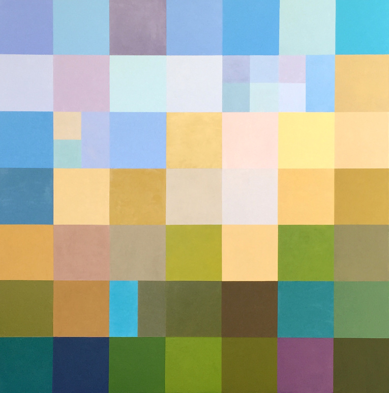
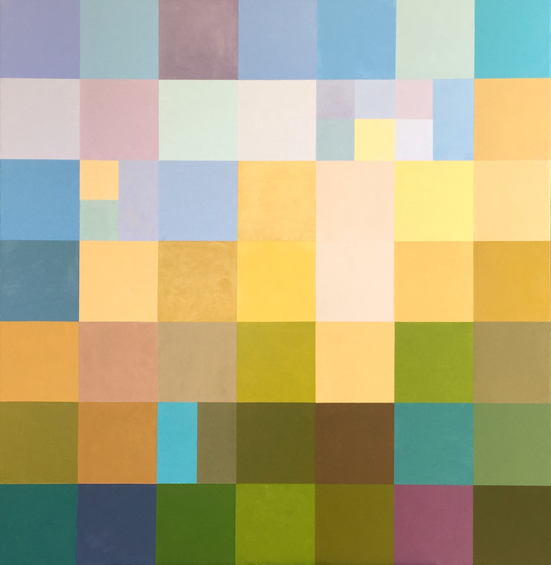
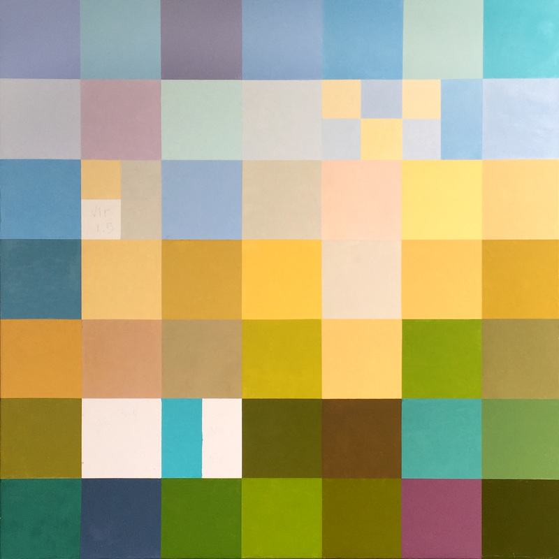
The above image shows the completed painting of Rancho Bodega. Looking at the image below, it shows how I struggled with so many yellows, and I struggled with the area with the small squares on the upper right. The design originally planned for more yellows up in that area, however, the design was off-putting. Presently it still creates an area of interest without feeling congested, and I like the variations of the blues and violets. In addition I altered the center part of the painting with a couple neutrals where there were so many yellows and golds. The variation creates a far more interesting painting.
Comments are closed.
|
Luminous Color Explorations
My name is Jill Keller Peters, and I am passionate about using color as a language to Archives
August 2020
Previous Archives
|


 RSS Feed
