|
Panel 5
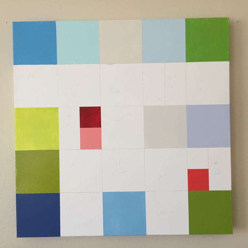
Here are a few new color blocks painted for Panel 5 and I like how it is going. I am feeling particularly challenged at this point and I don't know why. I keep telling myself that whatever needs to be adjusted, I can take care of it when I look at the entire installation. I am enjoying the small, deep red square. I think it's carrying a lot of weight in this one. It reminds me of something my daughter said. That pink is not enough of a color for the breast cancer emblem. It should be blood red. She should know. And now I know for the first time what this painting is about. http://finchdesign.us/themalmbergs/jessica/my-triple-awesomeness/ "And one other thing, about the pink for breast cancer. Seriously? This makes no sense. Little girl, little newborn baby pink. Sweet, cuddly, isn’t that cute pink. NO. For me, the color of breast cancer, that so many women face, is a deep dark magenta. It’s a velvety, nearly black purple. You face the possibility of your own too-early death? That is a dark color. You lose a beautiful part of your body? That is a deep color. The color of a bleeding heart, a dark, bleeding red. This is a woman’s color. It is feminine and strong, it is full of singing power, it is the center of the earth, it is a warm, black hole in the earth. It is darkness faced and a love found. It is not light and airy. It is pain and fear met with love. It has weight and gravitas and solemnity and beauty. It’s heavy and inspiring."
0 Comments
Leave a Reply. |
Luminous Color Explorations
My name is Jill Keller Peters, and I am passionate about using color as a language to Archives
August 2020
Previous Archives
|


 RSS Feed
