|
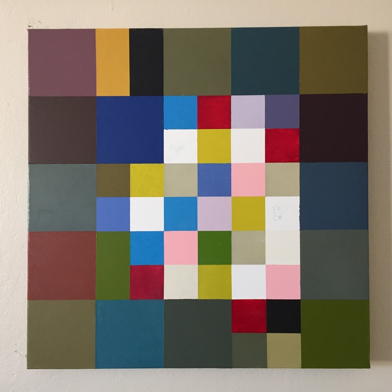
I made some adjustments today on this panel that I feel really good about. I changed four of the color blocks on the outside edges, the more somber tones. Some of them were to bright, and there were too many greens. I didn't want them to dominate the tone of the overall painting. While I am writing I see the upper left square seems to draw my eye too much, but "in person" it does not. It sits there beautifully, just the way it is supposed to.
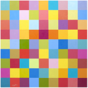
My next target, when the fresh paint has dried, is to soften the intensity of the blue square on the upper left below the gold tone. Its brightness draws too much attention, and I want it to set off the brighter, more clear hues in the center. The tones in the center need some adjustment as well. This painting as well as Panel 2 are an exploration based upon Paul Klee's Bluehendes series. I must admit that I got a bit lost on these, but I love digging my way out, and learning to identify just how I choose to handle this situation based on my own sense of color. By the way, it's great to be back home!
0 Comments
Leave a Reply. |
Luminous Color Explorations
My name is Jill Keller Peters, and I am passionate about using color as a language to Archives
August 2020
Previous Archives
|


 RSS Feed
