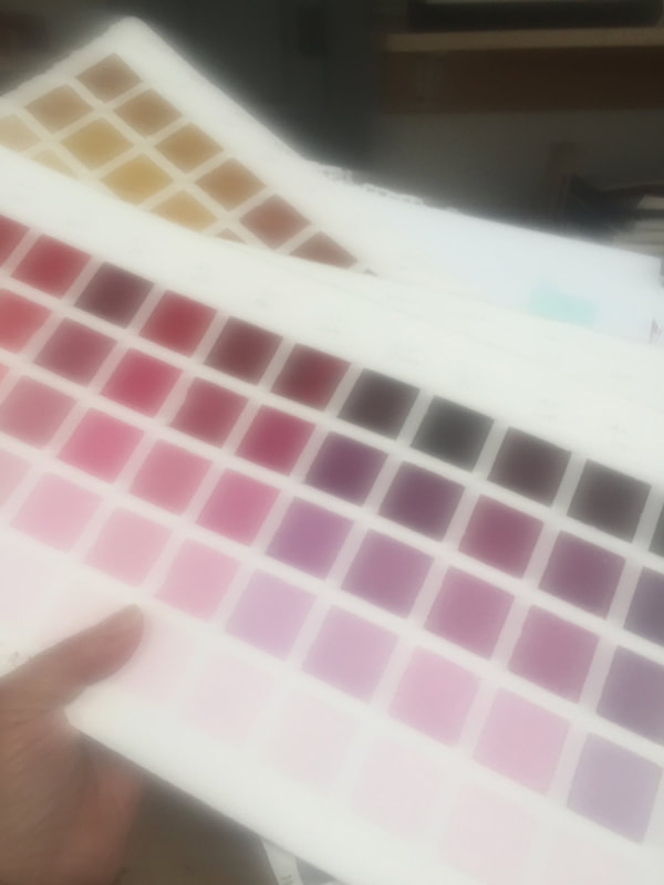
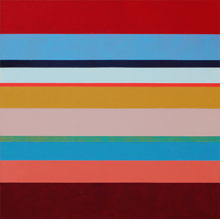
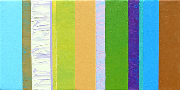
 It's interesting when I come to a place of reserved panic, for example what to take with me in my car when leaving home or work, with hope that all will remain, and undamaged the next time I show up . I left my studio early today because smoke from the Sonoma County fires was building up in that area. My studio is near the Walbridge Fire. This is the third damaging fire for 3 consecutive years in a row in close proximity to me, so I'm a little uncomfortable when I smell smoke, and is now engrained in my psyche to "get the hell out of Dodge" when I do. As I was packing up, I asked myself, "Wait! I should take something with me!"
I took the same thing that I chose last year - my color charts, the ones I made 12 years ago after losing my first born, full-term grandchild due to a cordal accident. I created 13 color charts after that unimaginable experience, because I wasn't able to paint anything else. Going over that auspicious time, I know that creating these color charts was the thing that grounded me. That must be the reason I grabbed them. They simply let me know that I will make it through this, too.
0 Comments
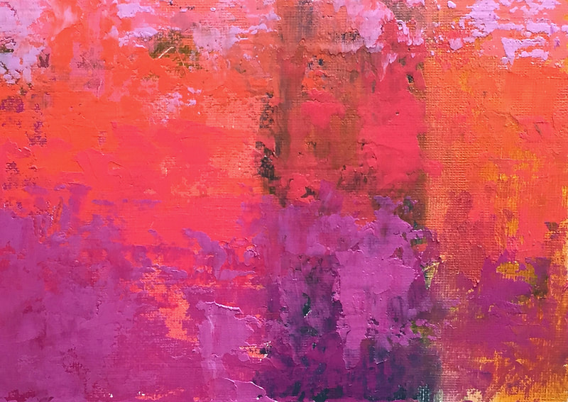
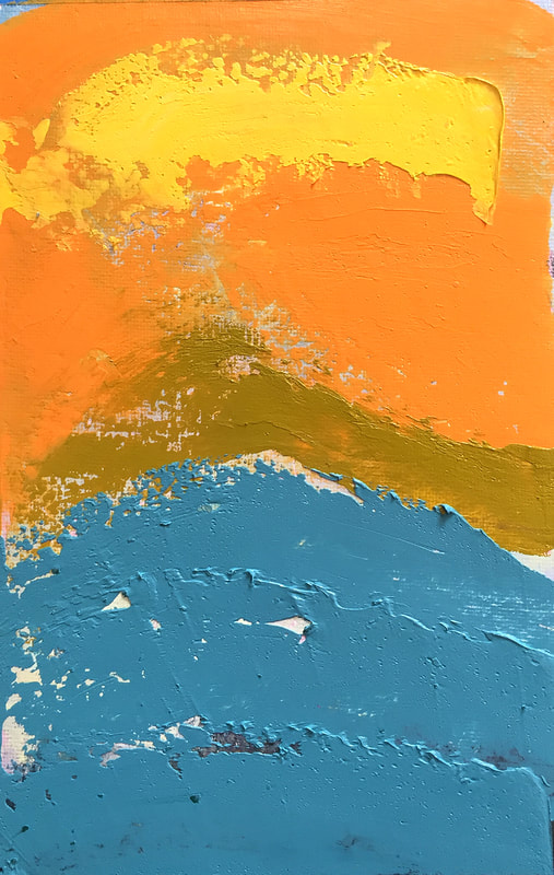
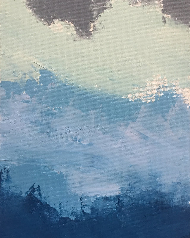
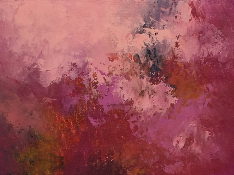
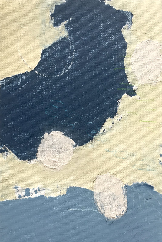
In March 2020 I committed to creating 30 small paintings in 30 days on canvas and on paper, exploring various attributes that I could discover by adding a product called Cold Wax Medium to oil paint. The practice became a flow of creative explorations with no predefined outcomes, and more of a state of curiosity, asking myself "how will the paint respond if I try this or that?" I sought to have an understanding of the way paint would move across the surface of the canvas (paper), to not be in control, and leave allowances for happy accidents that cause an appreciable interest in a painting. I was looking for organic visual effects and suggestions of patterns and designs that we see in nature. The experience was powerfully informative! I came across many happy surprises, and felt lost much of the time as well. What does an artist do when the world turns upside down? She paints. I was already involved in this experimental painting project when the global pandemic began to more quickly unfold; my challenge was to paint 30 paintings in 30 days during the month of March. I was exploring the effects of cold wax medium mixed with oil paint, and creating small works on canvas and paper. Some days it was hard to work because of the unprecedented grandiose circumstances circulating in the news and in my community. Ironically the collection conveys a sense of hope and peace, characteristic of my style. I paint with an emphasis on color, and I find that doing so lifts my spirits. Color gives me a dose positivity and expresses my love of life. Presented in this blog is the first series of 10. Each painting is available, for sale and ships free in U.S.A.
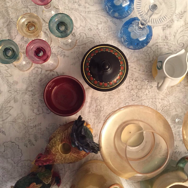
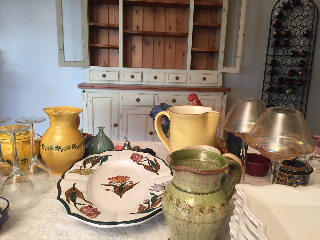
Stay tuned for a future release!! Donations from proceeds will be made to the Redwood Empire Food Bank. While painting the dining room today, I emptied out the hutch in order to be able to move it, and enjoyed seeing the contents and their palette, my life palette, in a modern geometric abstraction, (inspiration for an abstract painting). 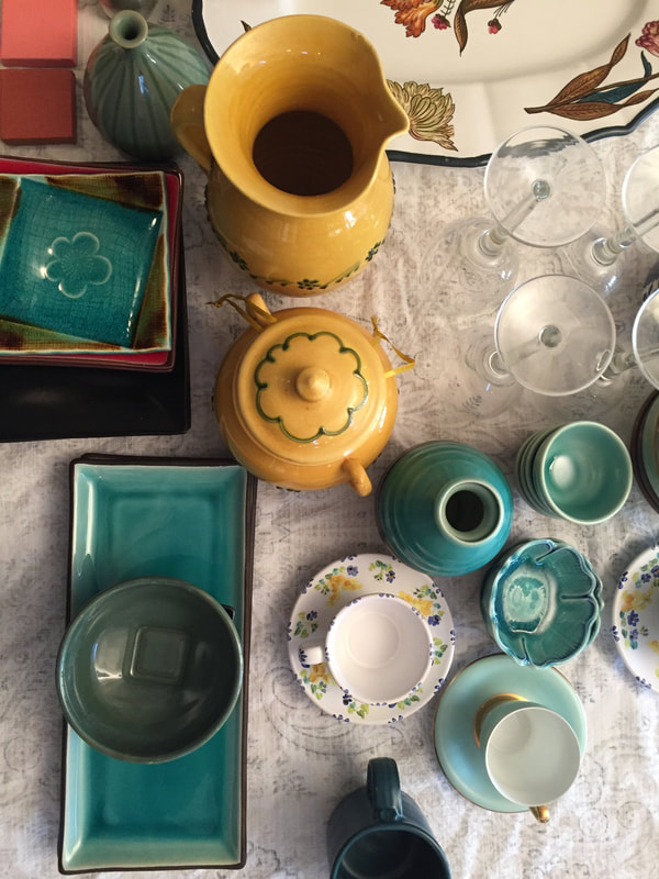 Although I'm pretty much a minimalist, I find it is very interesting to see the vibrant hues, the depth and richness that I would choose for my oil paintings, splayed out on the dining room table, abstracted. Initially I was attracted to the hues that were selected by the artisans and manufacturers that formed them. Currently, I found myself caught up in the shapes and patterns and saw my past through another lens.
The green pitcher above was purchased in a small town near Avignon, Fr., just after eating too much pasta bolognese that made me feel sluggish, causing me to peddle my bike with great effort. We were there just after 9/11, a surreal time for all of us, and I remember that I felt so wicked to be out enjoying such a luxurious escape bicycling around Provence for a good week. The pitcher now has a chip in it, imperfect and real, like my life. I love my life, I love being an artist. I deal with being imperfect. The vessels originated from Spain, Switzerland, France, Portugal, Portland, Oregon, and Venice, and are artworks of color and memories of travel and discovery. Locally, hand crafted objects were collected from Healdsburg and St Helena. As an artist, I relish seeing parts of life from a different perspective, from up above in this case. I see vessels and containers, holders of food, sustenance and flowers, all from happy times. I am so very grateful for these small bench marks of my life experience and envision them carrying on in the same way. I think I will to paint the hutch next. 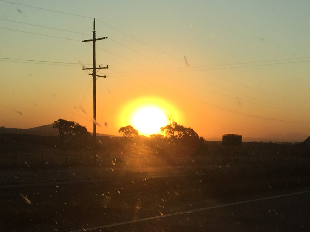 "EVACUATION" - a photo taken from our car early in the morning as we passed through the countryside near Petaluma along with over 150,000 others who evacuated during the Kencade fire in late October. We were away for four days. I am still hearing other people's stories, and can see the effect that it made on our community. We are sensitive, and we are survivors.
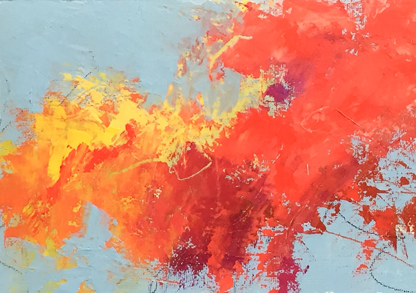
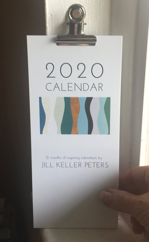
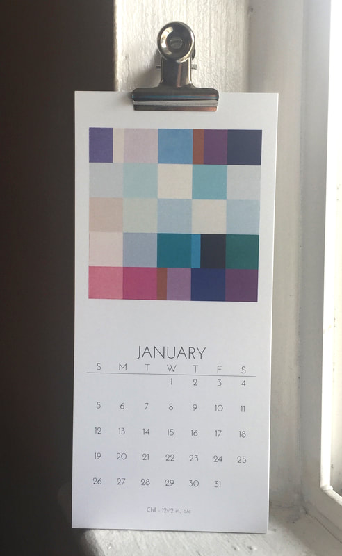
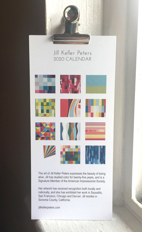
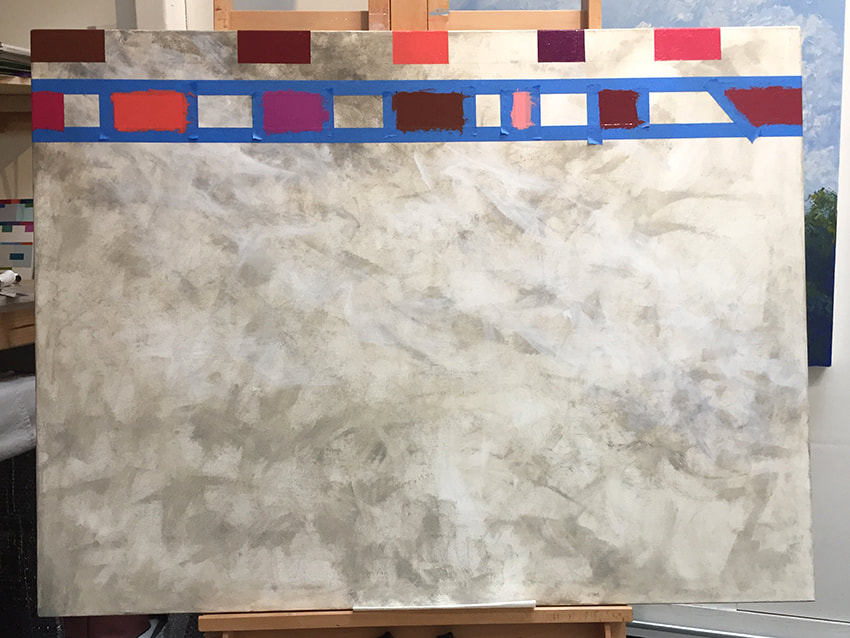
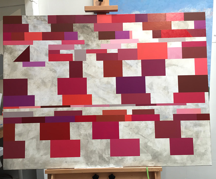
The artwork for my current exhibit, "Atmospheric & Over the Edge", was moved a number of times due to the interruption of the possible danger from the fire and the evacuations. I installed the show at Fulton Crossing the morning after we returned from the evacuation, and felt a dazed out, Herculean effort that I pulled off with some sort of nonchalance, as we all did during that time. The exhibit will remain in the featured artist gallery through December 29 at Fulton Crossing. We still have our 3rd Friday Open Studio the evening of December 20th as well. I invite you to join me there!! When I am at my desk organizing my life and looking up dates, I become a little impatient when I have to stop and check the calendar on my smart phone or desk computer, because doing so requires so many steps . . . . 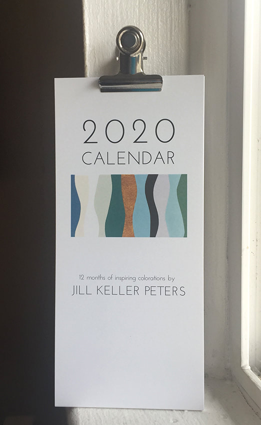 Last year I was gifted a narrow art-filled calendar that hung on a tiny nail near my desk. I loved using it and found that it much more easy to glance over to my right to reference a date, say, Tuesday the 19th, to see what day of the week it fell on. This year I decided to design my own narrow art-filled calendar for 2020 and share it with the public for purchase. It also seemed like a good idea to use it promotionally and give a calendar to my art collectors, and gallerists, and all who have supported and encouraged me over time, especially during the past year. I am not a graphics designer, but I do edit photos in photoshop and create layouts for postcards, newsletters and marketing pieces in inDesign. For the most part I have always enjoyed the process. So, it's official. The coming year, 2020, has birthed a new calendar that contains twelve months of pages in contemporary style colorations from images of original oil paintings that I have created this year. I wanted the content to invoke optimism with each passing page, to brighten up a space and help a fellow human being stay present and organized. It's fun to find what lies behind each calendar page, what will the next month look like? Will I like July as well as June? That's what I wanted to create, the particular pleasure of turning the calendar page and seeing a new delight. I have studied color for twenty-five years, and utilize its power to express the beauty of being alive. How perfect it is to inspire others in the form of a calendar. Share the joy of now, of color, and of connection with friends and family with Jill Keller Peters’ Art Filled 2020 Calendar. 7.75” x 3.5”, fastened at the top with a magnetic metal clip. Synergy is an epoch, intuitive painting. Oil on canvas, 48 x 36 x 1.5 in  Part 1: Synergy was not planned. It just happened. The underpainting for Synergy was a personal painting that I quietly titled Smoke and Ash (below). Meaning, it was never meant to be seen or exhibited, because it was too tender and a very personal painting. It is my memory of the Tubbs fire, standing out in the street with my neighbors in a fog of swirling smoke and ash that left my legs feeling weak. I created this painting a couple weeks after the fire and felt myself lost in the fog. 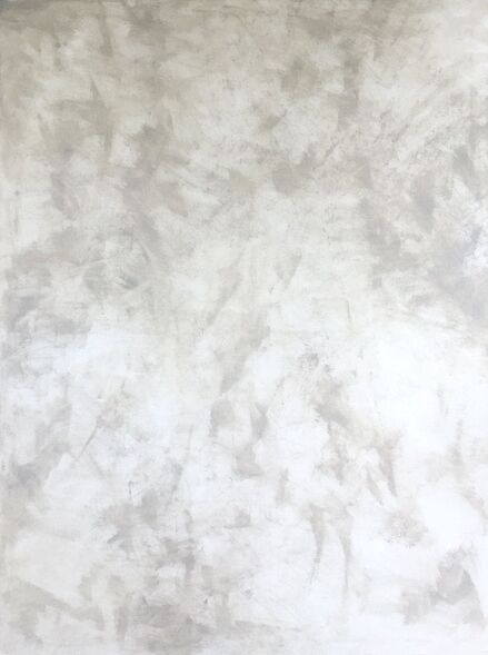 Part 2: The painting was stored in my shed until a year and a half later when I decided to create a painting in all red hues, an inspiration from a blog sent to me from Gamblin Artists Colors. Consciously, the painting of reds had nothing to do with fire, more a thing of passion, focused on spending time learning about interactions of Reds. I worked horizontally and intuitively on the painting with an intent to paint the reds in a way that they would move spatially on the plane of the canvas. Although I had an intimate memory of painting the underpainting I didn't really think about the previous content of the smoke and ash at the time, but more that it was making a very interesting background in the artwork, and that I wanted to include it into the composition. The Reds came began to describe a new strength, new curiosity and an unstoppable energy. I didn't do it, not out of consciousness, but out of my interaction to the paint. 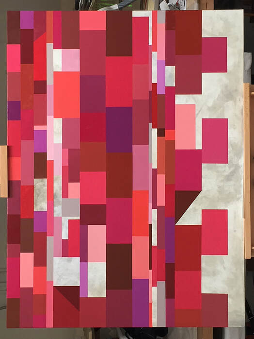 Eventually I switched to working vertically, filling in shapes of various sizes and hues to create interest and space, sometimes regretting losing the under layer. Epoch - Marking a place in time, a division of time. Synergy - Cooperative interaction. Synergy is currently exhibiting at Fulton Crossing Gallery November 1 through December 29 and is available through the gallery.
I discovered a new method of working with paint and tape this year that really resonates with me. I sought to learn how to paint lyrical hard edge curves that are both 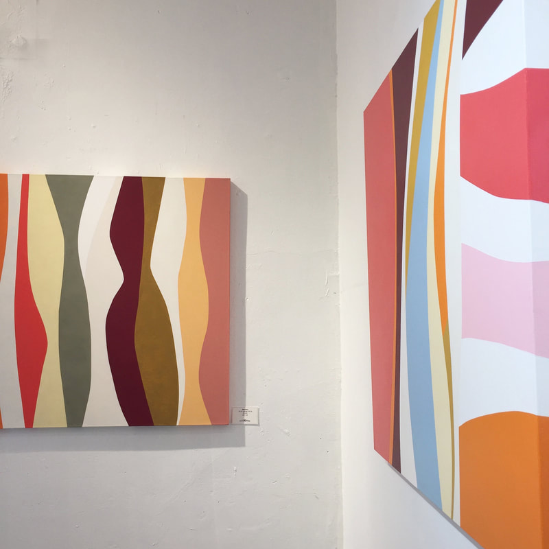 lyrical and intuitive. I don't lay out a design, but have an idea of movement in my head and pull tape across the canvas in a shape that I respond to. I paint the first curve shape and continue from there. The trick is that I cannot paint an adjacent shape until the first is completely dry, and since I paint in oil, it is often at least three days before I can proceed. Marimba is about the sixth painting that I have created in this approach. I love it's sensual movement and and rhythms. I particularly enjoy the subtle tonal differences between the white and off-white curves at top center. I can see many color palettes and individual wavy shapes that could be painted in this languid ambiguous style. 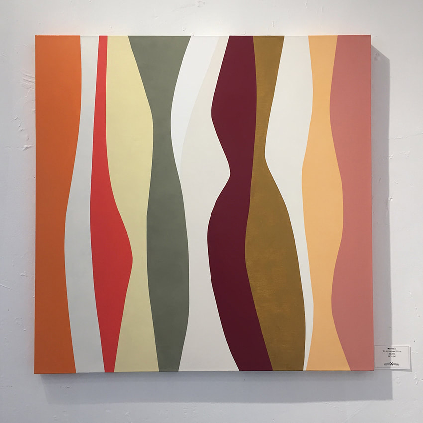 Marimba is currently exhibiting at Fulton Crossing Gallery November 1 through December 29 and is available through the gallery.
 "Passaggio" - oil on canvas, 36 x 36 in, La Crema Estate at Saralee's Vineyard For me, moving paint around on a surface is an exercise of an intuitive, intimate relationship with oil paint, color and my painting knife. It is similar to sitting in my oversized and out-of-date stuffed chair where I journal and meditate, and where my cat sits near my head on the back of the chair, purring. Yeah, painting is like purring.
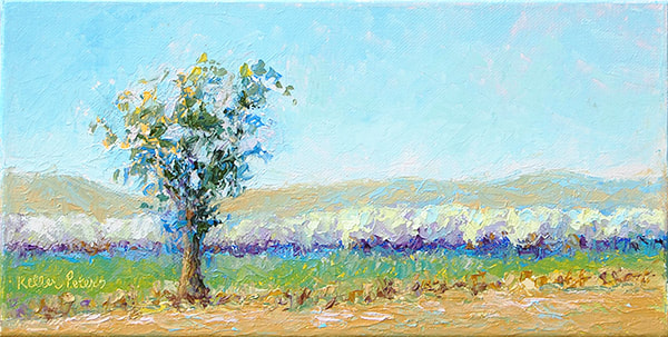
I think about all of the various aspects of my life while I am painting, a series of lovely, annoying, gritty, fabulous and regrettable episodes that are part of my collective existence, while I simultaneously critically consider color, line, space, harmony and balance. “Life” sits on the back burner in a big stew pot sharing space with my psyche, the painting process, and all the classical decisions and comparisons that create a piece of art. Today I’m pondering about how much the elements in the stew pot have to do with the final outcome of a painting, how “life” might become mashed up into the paint, and how the essence the life of an artist could perhaps reside forever, interlinked within the layers of paint, gesso and substrate of an artwork. Speaking for myself, I am painting the stew pot of L I F E. And it’s all about love. Jill Keller Peters Found Beauty on the I-5, 1, 2, 3, and 4 - Oil on canvas, 6" x 12" The painting is extended around the sides of each canvas. Available at La Crema Estate at Saralee's Vineyard. Each sold separately. On a previous post that I sent out in March, I wrote about the spark of creativity. The small works in the suite displayed above are inspired from a drive I took to Palm Springs in February along the bemoaned and boring Interstate 5. This drive was anything but boring, and I saw scene after scene of serene beauty lying in swaths of green, blue and white. In this series, I painted one literal impressionist painting of the land, sky and an almond orchard. The remaining three canvases were painted with the same color palette, but in varying expressions of richness and chroma, blended together or pulled apart. It was both challenging and fun. The small works are included in the paintings at my show at Fulton Crossing. These works are available. One of the best places to be is that moment when you get the spark to create something new. It is a moment that can wake you up in the middle of the night, loudly, or, more often, is affected by a series of colors, one moving into the next. Here lie three canvases, and they have an inspired thought, just waiting. They lie in between the planted seed of inspiration and the actual effort of employing pencil, charcoal, and paint. No sketch, just pictures flying through my head with possibilities of color harmonies, line and design.  They are small, 6" x 12", and I am painting them for a show that will be at Fulton Crossing in May. I am very enthused to get a start on them, but have to attend to some business before. However, after reading Annie Leibovitz's quote, I believe that they are just where they should be, ready, until I have cleared the way for full attention and the delight of painting them. - Jill Keller Peters |
Luminous Color Explorations
My name is Jill Keller Peters, and I am passionate about using color as a language to Archives
August 2020
Previous Archives
|


 RSS Feed
